
Table of Contents
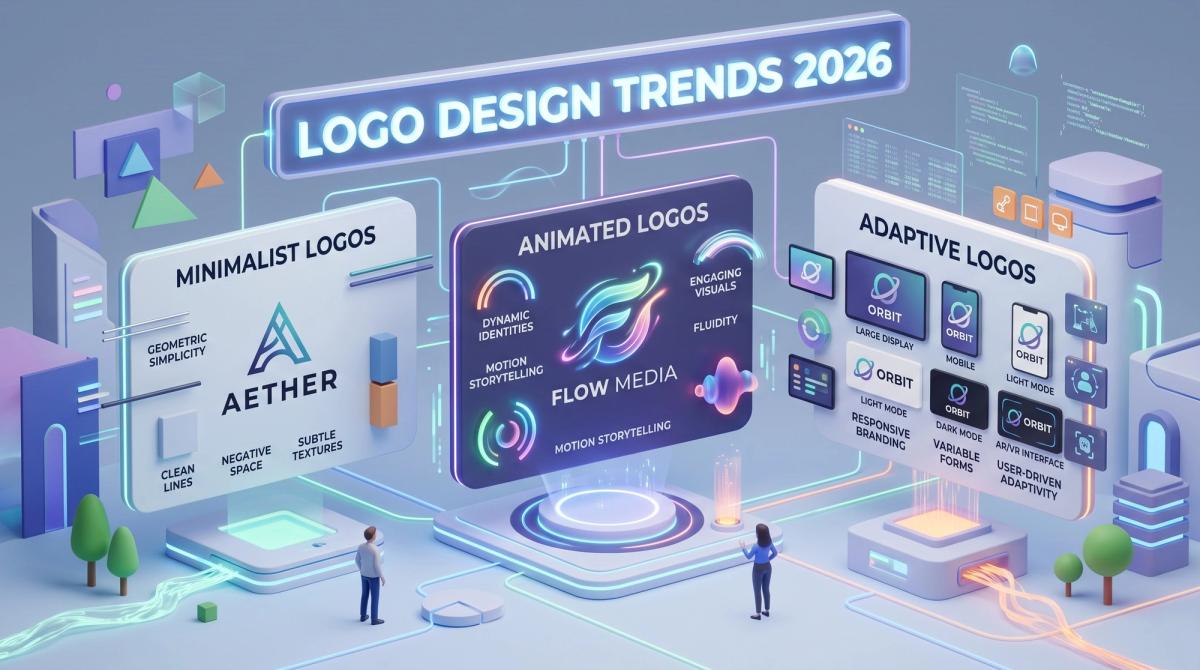
A logo used to be a static file you placed on a letterhead. In 2026, it behaves more like a small piece of software. It loads in a browser tab, shrinks into a favicon, animates on a splash screen, switches to dark mode and gets announced by a screen reader. If your logo cannot handle all of that, it is already falling behind.
This guide explains the logo design trends 2026 is bringing to the front, in plain language. If you are a CTO planning a rebrand, a product manager launching a new app, a marketer building brand recall or a developer who has to implement the assets, you will find practical takeaways here. We also cover the technical side, such as file formats, page speed and search visibility, because a good logo should look sharp and load fast.
Our earlier piece on logo design trends and brand authority covers how logos build trust. This one goes deeper into design and technical shifts.
Why Logo Design Matters More in 2026
Your logo is the fastest way people recognise you. It appears on your website, mobile app, social profiles, invoices, browser tabs, app stores and search results. Every one of those places has a different size, background and behaviour.
That is why modern logo design is about building a flexible visual identity: marks, colours, typography and rules that work together everywhere. A strong brand identity builds trust, and trust lifts clicks, sign-ups and sales. Professional brand identity design services now treat the logo as the centre of a wider system that includes brand guidelines, colour palettes and usage rules.
Three forces shape this year's logo trends: more screens in smaller spaces, motion as a normal expectation, and AI tools that make originality the real differentiator.
1. Adaptive and Responsive Logo Systems
The biggest shift in logo design is the move from one fixed logo to a family of logos. Think of it like responsive web design. Your full logo may include a symbol, a name and a tagline. That works well in a website header, but it becomes unreadable on a smartwatch or a browser tab.
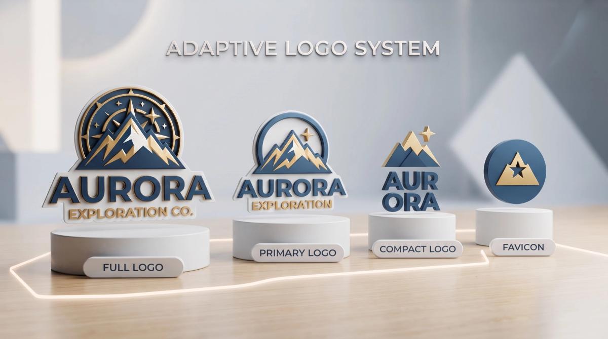
An adaptive logo system solves this with several versions:
- Full lockup: symbol, name and tagline for large spaces
- Primary logo: symbol and name for everyday use
- Compact mark: symbol only, for app icons and profile pictures
- Favicon: a simplified version that stays clear at 16 by 16 pixels
Each version is designed on purpose, not simply shrunk. Details are removed as the space gets smaller. For developers, this also means cleaner implementation, since you can swap the right file at the right breakpoint. Good agencies deliver these variations in the package, along with SVG, EPS and PNG files, so teams never have to improvise later.
If you are searching for responsive logo design for web and mobile apps, this is the trend to start with.
2. Motion and Kinetic Logos
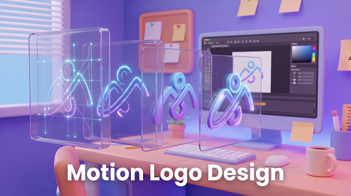
Static logos still matter, but animated logos are now common in apps, videos, loading screens and social media. A motion logo, also called a kinetic logo, adds personality in the first two seconds of an interaction.
The best motion logos are short and simple: a symbol drawing itself line by line, or a shape pulsing gently while a page loads. The animation should say something about the brand, such as speed, care or intelligence.
Keep these practical points in mind:
- Keep animations under three seconds
- Use lightweight formats such as animated SVG, Lottie or CSS instead of heavy video files
- Provide a static fallback and respect the reduced-motion setting on user devices
- Test on low-end phones so the animation does not slow down loading
Motion carries a performance cost, so designers and developers should plan it together from day one.
3. Variable Fonts and Expressive Wordmarks
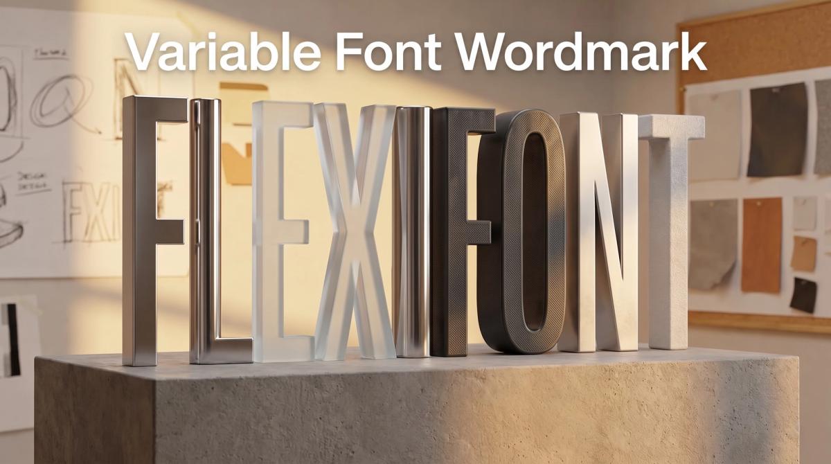
Wordmarks, which are logos made purely from a brand name, are getting bolder and more customised. Variable fonts are helping drive this. A variable font is a single font file that can flex its weight, width and slant. Brands can adjust letterforms for different contexts while keeping one recognisable style.
For tech companies, a wordmark is often the safest choice. It is easy to read, easy to remember and easy to place in a navigation bar. In 2026 you will see custom letter tweaks, such as a unique "a" or a pair of connected letters, that make a simple name feel one of a kind.
Tip: check that your font license covers logo use, or ask your designer to customise the letters so the logo is truly yours and easier to trademark.
4. Purposeful Minimalism
Minimalism is not new, but in 2026 it has grown up. The trend is not about stripping everything away. It is about keeping only what carries meaning. Clean geometric shapes, generous spacing and limited colour palettes help a logo stay clear at any size.
Here is a simple test: can someone sketch your logo from memory after seeing it once? If not, it may be too complex. Simple logos also convert easily into single-colour versions for print, embossing and dark backgrounds.
Avoid sameness, though. When every tech startup uses a rounded sans-serif and a soft gradient blob, nothing stands out. Add one distinctive idea, such as a clever negative-space shape or a signature angle.
5. Human-Made Texture in an AI World
As AI-generated visuals flood the internet, brands are leaning into details that feel human. Hand-drawn lines, slightly imperfect curves, organic shapes and custom illustrations signal that real people care about the brand.
This trend suits education, health, community and creative brands, and pairs nicely with a clean digital layout.
For technical audiences, the takeaway is simple: uniqueness is now a competitive advantage. A logo built from a generic prompt looks like thousands of others. A logo shaped by real research, sketches and testing looks like yours.
6. Bold, Accessible and Dark-Mode-Ready Colour
Colour is where logo design meets usability. In 2026, brands are choosing bolder, more confident colours, but they are also thinking harder about contrast and accessibility. Web accessibility guidelines recommend enough contrast between text and background, and that principle applies to logos too.
Dark mode has become a must. A logo that looks great on white can vanish on a dark background. Designers now create light, dark and sometimes monochrome versions from the start.
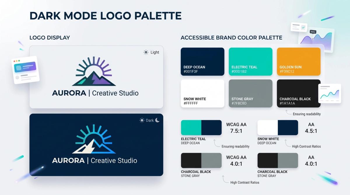
Some practical colour habits:
- Pick one main brand colour and one or two supporting colours
- Test every logo version on light, dark and busy backgrounds
- Check contrast ratios with free tools before final approval
- Define exact HEX, RGB and CMYK values in your brand guidelines
If you want to understand why certain colours feel trustworthy or energetic, our guide to marketing colour psychology explains how colour shapes user behaviour.
7. AI-Assisted Design With Human Direction
AI tools can now generate dozens of logo ideas in minutes. Used well, they speed up brainstorming, mood boards and early exploration. Used carelessly, they create generic, look-alike marks with unclear ownership.
The smart approach in 2026 is AI-assisted and human-directed. Let AI help with quick concepts, then let experienced designers refine, simplify and build the final vector artwork. Before you commit, run a trademark search and confirm that you can legally own and register the final design. Rules around AI-generated artwork vary by country and are still evolving, so treat this as a question for your legal advisor.
Automation helps behind the scenes too. For example, AI workflows and automations can resize and export brand assets in every format, or route design approvals automatically, saving hours of manual work.
8. Retro Revival With Modern Clarity
Nostalgia is a strong emotional shortcut. Many brands are borrowing from the past, such as rounded 1970s-style lettering, badge-style emblems and classic monograms, while updating them with cleaner lines and better digital performance.
The key is to borrow the feeling, not the clutter. A retro badge can look fantastic on packaging, but it needs a simplified version for small screens. If you go retro, always build a modern, minimal companion logo alongside it.
Retro works best when it fits your story and your audience, not just what is popular.
How to Choose the Right Logo Trend for Your Brand
Trends are tools, not rules. Before following one, ask five questions:
- Who is our audience, and what do they trust?
- Where will our logo appear most: web, app, print or video?
- Will this style still look good in five years?
- Is it distinctive enough to own and trademark?
- Can our team implement it without slowing down the website or app?
If a trend fails two or more, skip it. A timeless logo with one modern touch usually beats a fully trendy one that ages in a year. Plan design and code together too. Our article on the intersection of brand design and code shows why that partnership matters.
A Technical Checklist for Developers, Testers and Marketers
A logo is also a web asset, so it affects speed, accessibility and SEO. Use this checklist before launch:
1. Use SVG for the main logo. It stays sharp on every screen and is often lighter than PNG.
2. Compress and size every file. Our guide to lazy loading and image optimization for Core Web Vitals shows how to keep pages fast.
3. Add descriptive alt text, such as "Cinute InfoMedia logo", so screen readers and search engines understand the image.
4. Provide favicon and app icon sizes for browsers, iOS and Android.
5. Link the logo to your homepage and add Organization schema markup with the logo URL, which helps search engines display your brand correctly.
6. Set width and height attributes so the logo does not cause layout shift.
7. Test light mode, dark mode, high-contrast mode and reduced-motion settings on real devices.
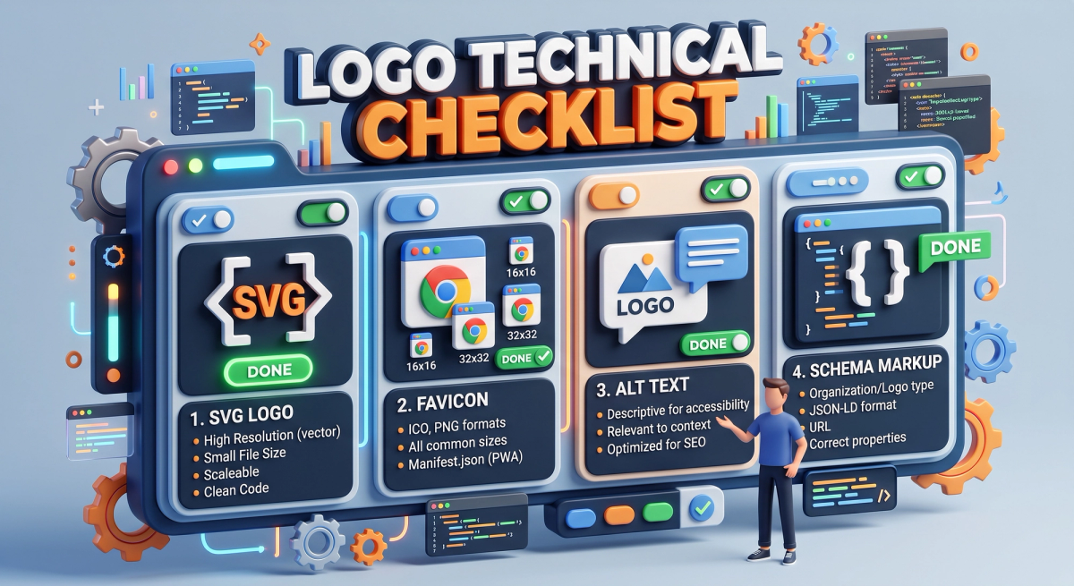
Search engines read your site structure, speed and metadata, not just your artwork. A technical SEO audit can catch logo-related issues such as missing alt text, oversized files or broken schema.
Frequently Asked Questions
What are the top logo design trends for 2026?
The main logo design trends for 2026 are adaptive logo systems, motion logos, variable-font wordmarks, purposeful minimalism, human-made texture, accessible and dark-mode-ready colour, AI-assisted design with human direction, and retro revival with modern clarity.
Is minimalist logo design still popular in 2026?
Yes. Simple logos scale well across screens, but brands now add one distinctive idea so they do not look like everyone else.
Should I use AI to design my logo?
AI is useful for early ideas, but a professional designer should refine and finalise the logo. Also check trademark and ownership rules with a legal advisor before you register an AI-assisted design.
Which file formats does a modern logo need?
At minimum, keep SVG for the web, PNG for general use, PDF or EPS for print, and favicon and app icon files for browsers and mobile devices. Editable source files are also important for future updates.
How often should a brand update its logo?
There is no fixed rule. Many brands refine every few years and plan a bigger refresh only when the business, audience or product changes significantly.
Conclusion: Design a Logo That Works Everywhere
The logo design trends 2026 has brought share one idea: a logo must be flexible. It should adapt to any screen, work in light and dark mode, move when needed, stay accessible and still feel unmistakably human. Strategy, clarity and testing are what make a logo last.
At Cinute InfoMedia, our team combines brand identity, web development, SEO and AI-powered automation, so your logo looks great and performs well from day one. Ready to build a brand that stands out? Talk to our team for a free brand and digital audit.
Related Articles
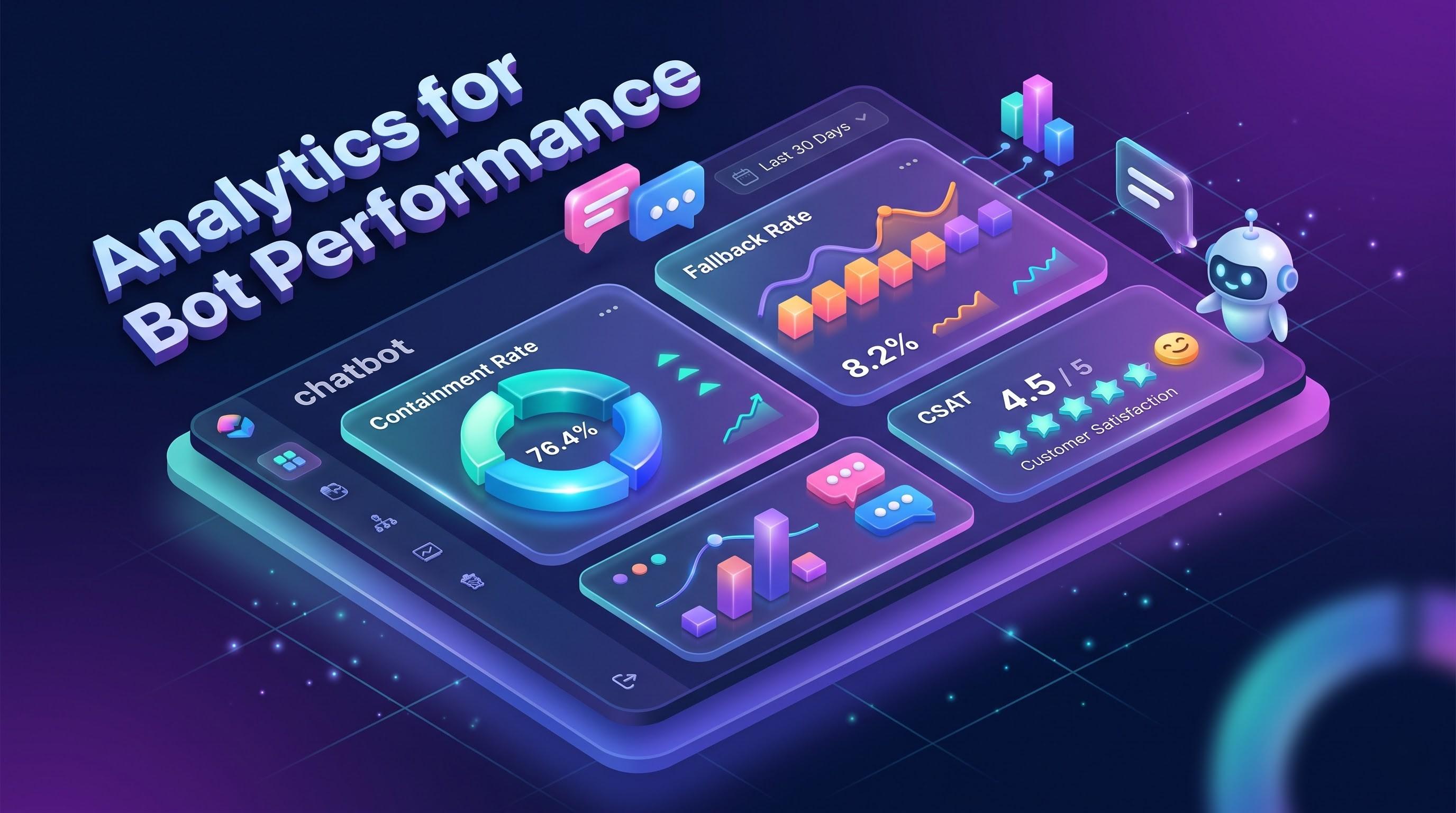
Analytics for Bot Performance: How to Measure, Improve and Prove Your Chatbot's Value
Your chatbot is live, but is it working? This guide explains analytics for bot performance in plain language: the metrics that matter, how to set up tracking, and how to turn conversation data into better answers, lower costs and measurable ROI.
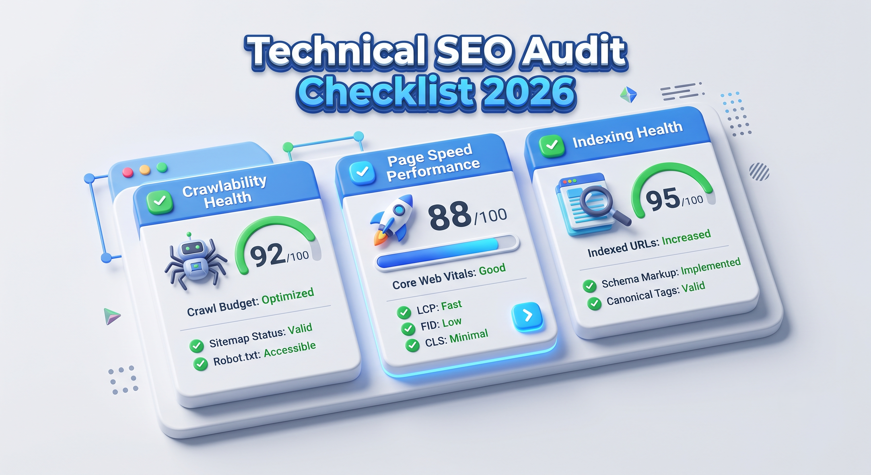
Technical SEO Audit Checklist 2026: The Complete Step-by-Step Guide
A technical SEO audit finds the hidden problems that stop search engines from crawling, rendering and ranking your pages. This 2026 checklist walks developers, testers, CTOs and marketers through every step, from crawlability and Core Web Vitals to structured data and AI search readiness.
How to Turn YouTube Shorts Into a Measurable Performance Marketing Channel
Are YouTube Shorts ads worth it? Learn how to turn Shorts into a measurable performance marketing channel: which campaign types to use, which metrics matter (hook rate, CPA, ROAS, view-through conversions), how to build vertical creative that converts, and how to measure results honestly.