
Table of Contents
Have you ever wondered why almost every major social media network, tech giant, and financial institution uses the color blue? Or why clearance sales are always advertised in bright, bold red?
This is not a coincidence. It is marketing color psychology in action.
For a long time, the B2B world operated on the assumption that business software, enterprise solutions, and corporate services were bought purely on logic. "Give them the features, show them the price, and they will buy," the old saying went. However, modern Chief Technology Officers (CTOs), Product Managers, and enterprise buyers are humans first. They are influenced by the same subconscious triggers, emotions, and psychological cues as any consumer.
In this comprehensive guide, we will break down how you can master marketing color psychology fast. We will explore the hidden meanings behind colors, the undeniable Return on Investment (ROI) of choosing the right palette, and most importantly for tech leaders why an incredible color strategy is completely useless if it is not backed by rigorous, world-class software testing.
Let us dive into the silent language of colors.
Why B2B Leaders Must Care About Color Psychology
When you are a CTO or a Product Manager, your daily focus is usually on sprint velocities, server uptimes, feature rollouts, and tech debt. Color palettes often seem like the domain of the marketing or design departments. However, this is a dangerous misconception.

Color psychology is the study of how colors affect human behavior and decision-making. In a B2B context, the colors of your SaaS dashboard, your landing pages, and your application interfaces dictate how users perceive your product's reliability, speed, and security.
The 90-Second Rule
Research shows that people make a subconscious judgment about a product within the first 90 seconds of viewing it. Remarkably, up to 62% to 90% of that assessment is based on color alone.
If your enterprise software looks outdated, chaotic, or confusing because of a poor color scheme, the perceived value of your backend engineering drops to zero. Users will assume your code is as messy as your interface.
For Product Managers, color is a tool to guide user behavior. It highlights what is important, downplays what isn't, and gently pushes the user down the conversion funnel. For CTOs, ensuring that these colors render perfectly without breaking the user experience is a critical quality assurance mandate.
Decoding the Colors in B2B Marketing
To master color psychology, you must understand the basic vocabulary. Let us decode the most prominent colors used in business, what they mean, and when you should use them.
1. Blue: The Corporate Anchor
The Psychology: Blue represents trust, security, logic, and serenity. It is non-invasive, calming, and highly professional. The B2B Application: Blue is the undisputed king of the B2B tech world. Think of IBM, HP, Intel, Dell, and countless cybersecurity firms. If you are selling a product that requires a high level of trust like data storage, financial software, or cloud infrastructure blue is your go-to color. The Catch: Because everyone uses blue, it can sometimes feel cold or generic. You must pair it with strong secondary colors to stand out.
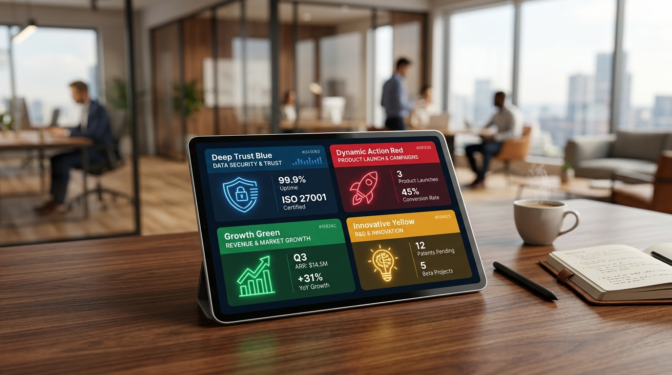
2. Red: Urgency and Action
The Psychology: Red is the color of fire and blood. It raises the heart rate, creates a sense of urgency, and commands immediate attention. It signifies power, passion, and sometimes danger. The B2B Application: You rarely see a B2B software tool entirely painted in red, as it causes visual fatigue. Instead, red is the ultimate accent color. It is used for "Call to Action" (CTA) buttons, error messages, and limited-time enterprise discount banners. Pro Tip for PMs: Changing a CTA button from green to red has been shown in various A/B tests to increase click-through rates by up to 21%, simply because it stands out against standard corporate backgrounds.
3. Green: Growth and Harmony
The Psychology: Green is universally associated with nature, growth, wealth, and forward momentum (think green traffic lights). It is easy on the eyes and promotes a sense of balance. The B2B Application: Green is incredibly popular for human resources (HR) software, financial growth tools, and eco-friendly tech initiatives. It is also the universal color for "Success" in UI design (e.g., "File Uploaded Successfully").
4. Yellow: Innovation and Clarity
The Psychology: Yellow is the color of sunshine. It evokes feelings of happiness, optimism, and youthful innovation. However, it is also the color of caution (think yellow warning signs) because it captures attention instantly. The B2B Application: Yellow is excellent for tech startups trying to disrupt a legacy industry. It shows you are fresh, modern, and thinking differently. However, it must be used sparingly as too much yellow can cause anxiety and eye strain on digital screens.
5. Black and White: The Premium Contrast
The Psychology: Black represents luxury, power, and sophistication. White represents cleanliness, simplicity, and space. The B2B Application: Many high-end SaaS tools and premium consulting firms are moving toward minimalist, monochrome designs. "Dark Mode" interfaces (heavy on blacks and dark grays) are highly favored by developers and tech professionals because they reduce eye strain and look incredibly sleek.
The Concrete ROI Factors of Color Psychology
Why should a business invest time and money into revamping its color strategy? The answer lies in the Return on Investment. B2B purchases are high-ticket items. Even a fractional increase in conversion rates can mean millions of dollars in revenue.
Here are the concrete ROI factors that should interest every B2B stakeholder:
1. Increased Conversion Rates
As mentioned earlier, optimizing the color of your primary CTA buttons can yield immediate results. If a user lands on your pricing page, the button that says "Request a Demo" needs to be the most visually striking element on the page. By contrasting it perfectly with the background, you reduce cognitive load and make the next step obvious.
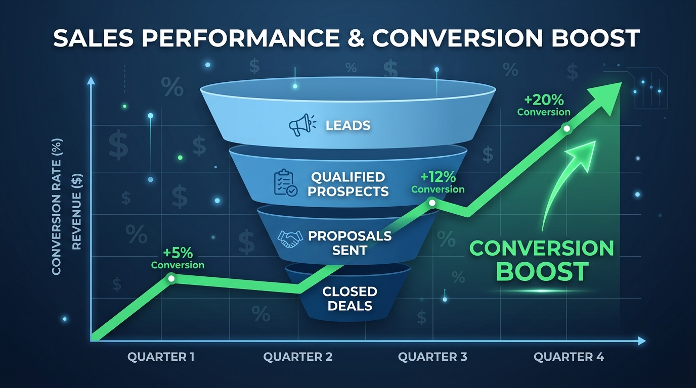
2. Reduced Bounce Rates
A harmonious color palette keeps users on your page longer. If your colors clash or text is hard to read (poor contrast), users will experience "friction" and leave. Better colors mean a lower bounce rate, which directly improves your SEO rankings and keeps potential buyers in your ecosystem.
3. Enhanced Brand Recognition
Color increases brand recognition by up to 80%. When you see a specific shade of magenta, you immediately think of T-Mobile. A consistent, strategic color palette ensures that your brand stays in the minds of B2B buyers long after they close the browser tab.
4. Faster User Onboarding
For Product Managers, color is an educational tool. By consistently using specific colors for specific actions (e.g., all primary actions are blue, all secondary actions are gray, all destructive actions are red), users learn how to navigate your complex SaaS product faster. This reduces support tickets and increases user retention.
The Crucial Step - Testing Your Color Strategy
Here is the harsh reality that many designers overlook: A beautiful color palette is completely worthless if it breaks when coded, alienates users with disabilities, or fails to render properly across different devices.

This is where the worlds of marketing psychology and software engineering collide. CTOs and technical leaders know that implementing a UI/UX overhaul is fraught with risks. Changing the CSS (Cascading Style Sheets) of an enterprise application to reflect new brand colors can introduce a host of unforeseen bugs.
To truly master marketing color psychology and reap its ROI, you must back your design choices with rigorous software testing. Here is how specialized testing ensures your colors actually work in the real world:
1. Accessibility Testing: Reaching Every User
Approximately 300 million people globally have some form of color blindness. If your software relies entirely on color to convey information (e.g., a green dot for "Server Online" and a red dot for "Server Offline"), you are alienating a massive segment of users. Your color strategy must comply with WCAG (Web Content Accessibility Guidelines) regarding contrast ratios. To ensure your digital assets are inclusive, engaging a professional QA team for Accessibility Testing Services is non-negotiable. It protects you from legal liabilities and expands your market reach.
2. Usability Testing: Proving the Psychology
You might believe that a bright orange "Subscribe" button is psychologically optimal. But does your specific target audience agree? You cannot guess user behavior; you must test it. By utilizing robust Usability Testing Services, you can observe real B2B users interacting with your new color schemes. You will see firsthand if the colors guide them naturally through the workflow or if they cause confusion and hesitation.
3. Compatibility Testing: The Cross-Browser Nightmare
Colors do not look the same on every screen. A vibrant, trusting blue on a high-end Retina Mac display might look dull, washed out, and cheap on an older Windows laptop monitor. Furthermore, different web browsers (Chrome, Safari, Edge) render CSS differently. To ensure that your carefully chosen psychological colors evoke the exact same emotion across every single device, OS, and browser, you need comprehensive Compatibility Testing Services.
4. Functional Testing: Don't Break the Code
It sounds simple to "just change the button color." However, in complex, legacy enterprise software, UI elements are often deeply tied to backend scripts. Changing a visual class can inadvertently disable a button's click functionality. Whenever you alter the user interface, Functional Testing Services are required to verify that the application still works exactly as intended. The most psychologically compelling button in the world will yield an ROI of zero if it does not actually submit the form when clicked.
5. Automation Testing: Protecting the UI at Scale
Modern SaaS companies release code daily or weekly. With rapid deployments, a developer might accidentally push code that overwrites your marketing colors, turning your brilliant primary buttons back to a default, uninspiring gray. By implementing Automation Services, specifically visual regression automation, your QA systems will automatically scan every new build. If a color hex code shifts by even a single pixel, the automated test catches it before it reaches your customers.
6. User Acceptance Testing (UAT): The Final Sign-Off
Before a massive rebranding or color overhaul goes live to the public, it must pass through the ultimate gatekeepers: your internal stakeholders and beta clients. User Acceptance Testing ensures that the final product aligns perfectly with the initial business requirements set forth by the Product Managers and CTOs. It is the final validation that the new colors achieve the desired psychological effect.
7. Regression Testing: Maintaining System Stability
When you inject new UI components, animations, or styling into an existing application, you risk breaking older, unrelated features. A thorough round of Regression Testing guarantees that your shiny new frontend design has not caused a catastrophic failure in the backend database or legacy modules.
8. Ad-Hoc Testing: The Human Touch
While automated scripts are great, they don't have human eyes. Sometimes, a color combination technically passes contrast tests but just "looks weird" or unappealing in a specific, obscure workflow of your app. Ad-Hoc Testing involves QA experts freely exploring your application without rigid scripts, actively trying to break the UI or find visual inconsistencies that automated tools might miss.
9. Bringing It All Together: Managed Testing
For a CTO or a busy Product Manager, coordinating accessibility, compatibility, functional, and automated testing for a massive UI overhaul is a daunting task. It drains internal engineering resources. This is where partnering with a premium QA firm for Managed Testing Services becomes a game-changer. An external team of experts takes complete ownership of validating your application, allowing your internal developers to focus on building core features while ensuring your visual strategy is flawlessly executed.
A Step-by-Step Guide to Implementing Your Color Strategy
Now that we understand the psychology, the ROI, and the absolute necessity of testing, how do you actually implement this in your B2B organization? Follow this simple roadmap.
Step 1: Audit Your Current Interface
Take a hard look at your current website, SaaS dashboard, and marketing materials. Are your colors intentional, or did they just happen over time? Do they align with the emotion you want your B2B buyers to feel?
Step 2: Define Your Core Brand Personality
Are you a stable, highly secure enterprise data vault? (Lean into dark blues and slate grays). Are you an AI-driven, disruptive startup? (Experiment with vibrant purples, electric blues, or yellows). Your colors must reflect your brand's core identity.
Step 3: Establish the 60-30-10 Rule
In UI design, the 60-30-10 rule is a golden standard:
- 60% of your design should be your dominant color (usually a neutral background like white or light gray).
- 30% should be your secondary color (your brand color, like corporate blue).
- 10% should be your accent color (a highly contrasting color like red or orange, used exclusively for CTA buttons and alerts).
Step 4: Align with Development and QA
Once the design team has the perfect psychological palette, bring the CTO, Product Managers, and QA leads into the room. Discuss how this will be coded.
- Will it affect load times?
- Are the new colors accessible?
- What is the timeline for deployment?
Step 5: Test, Test, Test
Before the launch, deploy your comprehensive testing strategy. Ensure that the new designs undergo functional, compatibility, and usability evaluations. Remember to leverage Cinuteinfomedia comprehensive testing solutions to guarantee a bug-free rollout.
Step 6: Monitor the Metrics
Once the new colors are live, watch your analytics. Are bounce rates dropping? Are demo requests increasing? Is user onboarding moving faster? Let the data validate your psychological choices.
Frequently Asked Questions (FAQs)
1. Does color psychology really work in B2B marketing?
Yes, absolutely. While B2B buyers are making corporate decisions, they are still human beings influenced by subconscious emotional triggers. Colors build initial trust, dictate brand perception, and guide users toward conversion actions (like booking a demo) just as effectively as they do in B2C marketing.
2. What is the best color for a Call to Action (CTA) button?
There is no single "magic" color, but the rule of thumb is contrast. Your CTA button should be a color that stands out sharply against your background. Often, warm colors like red, orange, or bright green perform exceptionally well because they draw the eye naturally and create a sense of action.
3. Why is accessibility testing important for brand colors?
Millions of users suffer from visual impairments or color blindness. If your brand colors do not have sufficient contrast (as defined by WCAG standards), these users cannot read your content or navigate your software. This results in lost revenue, poor user experience, and potential legal compliance issues.
4. How does changing colors affect software functionality?
In complex software, visual elements are tied to code. Modifying the CSS to change a color scheme can inadvertently alter the layout, overlap clickable elements, or cause bugs across different web browsers. This is why visual updates must always be followed by strict functional and compatibility testing.
5. How often should a SaaS company update its color palette?
A brand's core identity should remain relatively stable to build recognition. However, UI elements, landing pages, and dashboard aesthetics should be continually A/B tested and refreshed every few years to ensure they meet modern design standards and continue to optimize conversion rates.
Conclusion
Mastering marketing color psychology is not a dark art; it is a measurable, strategic business decision. For B2B companies, where the sales cycle is long and trust is paramount, the colors you choose dictate how potential clients perceive your authority, security, and innovation.
However, as we have explored, a brilliant color concept is only half the battle. In the digital world, execution is everything. A beautifully designed, psychologically optimized SaaS product will still fail if the colors don't render properly on a mobile device, if the contrast makes text unreadable for visually impaired users, or if a CSS update breaks a critical functional button.
For CTOs and Product Managers, the ultimate takeaway is synergy. Combine the emotional power of color psychology with the unyielding technical rigor of software testing. By doing so, you don't just build software that works you build software that connects, converts, and consistently drives massive ROI.
Related Articles
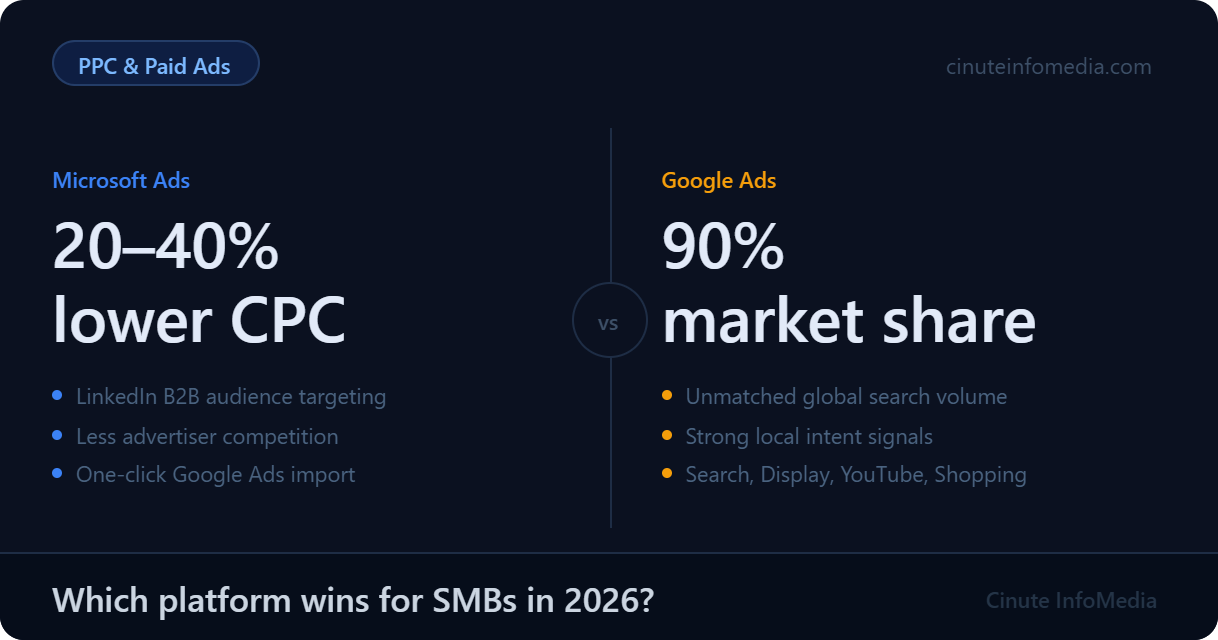
Microsoft Ads vs Google Ads: An Honest Comparison for Small Business Owners
Google Ads dominates search but Microsoft Ads is quietly giving SMBs a 20–40% lower cost-per-click with less competition and powerful LinkedIn B2B targeting. Here's an honest breakdown of both platforms to help you decide where your ad budget works hardest in 2026.

How to Run Microsoft Ads for SMBs Without Wasting Budget
One in four ad dollars vanishes on clicks that never convert. This guide shows SMBs how to run Microsoft Ads profitably without wasting a rupee of budget.

11 Proven Twitter Community Building Tactics for SMEs
Followers don't pay the bills communities do. Here are 11 proven Twitter community building tactics that turn passive SME audiences into loyal buyers.