Table of Contents
In the rapidly shifting digital landscape of 2026, a logo is no longer just a static mark on a screen; it is the fundamental "DNA" of your digital presence. For over 25 years, I have watched the "Visual Web" evolve, but 2026 marks the most significant shift yet. This is because search engines have officially integrated Advanced Computer Vision to analyse visual assets as part of their E-E-A-T (Experience, Expertise, Authoritativeness, and Trustworthiness) evaluation.
If your logo looks outdated or loads slowly, it’s not just a design failure—it’s a ranking liability. At Cinute Infomedia, we bridge this gap by treating Brand Identity Design as a technical SEO discipline. We ensure that every pixel is optimized for search bots and human psychology alike.
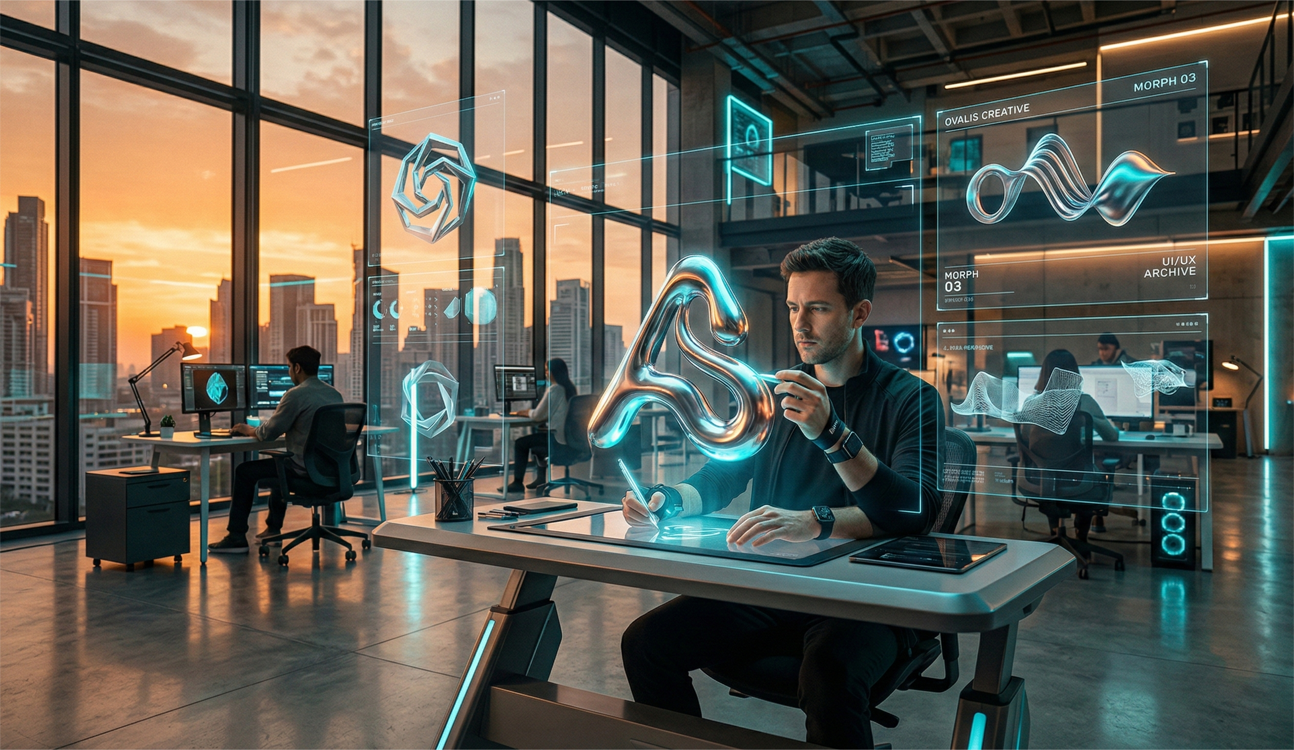
1. Kinetic & Variable Branding (The "Living" Logo)
Static logos are increasingly seen as "dead pixels" by the 2026 consumer who is accustomed to constant, fluid motion. Kinetic branding allows your identity to respond to user behaviour, such as scrolling, hovering, or even voice commands.
- The Psychological Hook: Movement triggers a primitive survival response in the human brain, ensuring that your brand is noticed before the user even reads a single word.
- The Technical Edge: By utilizing Lottie-based animations, we maintain ultra-low file sizes that actually help your site meet Google's "Interaction to Next Paint" (INP) requirements.
- Future-Proofing: These logos are built to transition seamlessly from your website to high-refresh-rate wearable displays, ensuring a consistent look across all 2026 hardware.
2. Neumorphism 2.0 (Tactile Digitalism)
The digital world of 2026 is moving back toward a "Physical Feel." Neumorphism 2.0 uses "soft-touch" visuals-shadows and highlights-to make digital elements look like they are extruded from a physical surface.
- User Comfort: This trend reduces digital eye strain by mimicking the way light hits real-world objects, making your interface feel familiar and safe.
- Conversion Power: A tactile logo on an app icon creates a "pressable" urge, significantly increasing the open rates for your Mobile App Development projects.
- Design Depth: Unlike the flat designs of the past, this approach allows for more complex storytelling through light and shadow, giving your brand a "premium" aura.
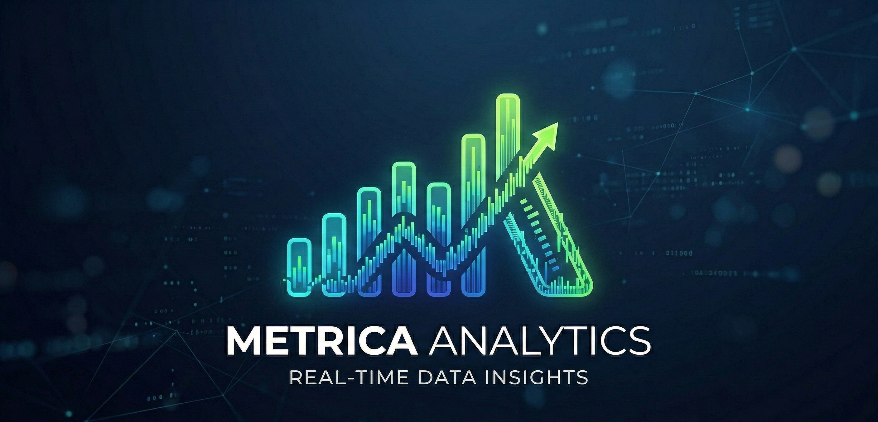
3. Data-Visualized Branding (The "Smart" Identity)
Transparency is the primary currency of 2026. A "Smart Logo" doesn't just represent a brand; it broadcasts its real-time performance and values.
- Real-Time Trust: Imagine a logistics logo that subtly changes colour based on delivery efficiency-this level of honesty creates an unbreakable bond with the consumer.
- SEO Relevance: Google’s robots are now capable of "reading" live data-embedded images, which allows your brand to appear in highly specific, data-driven search results.
- Authority Building: By making your data visual and public, you position yourself as a market leader in your specific niche of Digital Marketing.
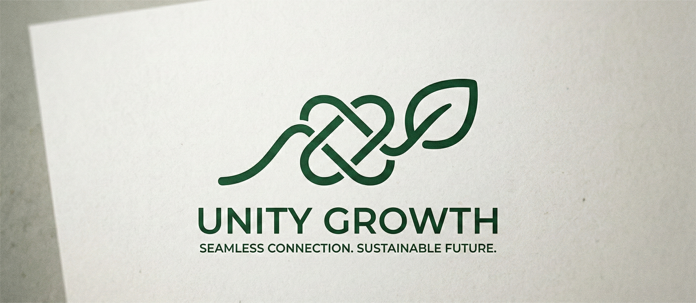
4. Eco-Conscious Minimalism (Sustainable Pixels)
Sustainability has moved from a "marketing buzzword" to a "technical requirement." In 2026, Google officially prioritizes energy-efficient websites.
- Dark Mode Optimization: We design logos that look stunning in dark mode, which saves significant battery life on mobile OLED screens.
- Minimalist Efficiency: By stripping away non-essential "pixel weight," we ensure your logo renders instantly, even on low-bandwidth satellite internet connections.
- Green Ranking Signals: An eco-conscious design reduces your server load, which is a subtle but powerful signal to search engines that your SEO Services India are technically superior.
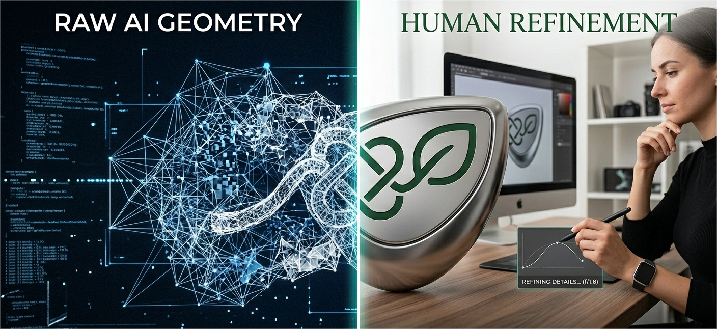
5. AI-Human Synergy (The "Soulful" Design)
With the internet saturated with AI-generated "junk," consumers in 2026 are desperately searching for signs of "Humanity."
- The Anti-Generic Movement: We use AI to iterate concepts at light speed, but our human designers add the "Bespoke Imperfections" that make a brand feel authentic and approachable.
- Trust Building: When a logo looks too "perfect," the 2026 brain flags it as a bot. Our designs focus on "Human-Centric Geometry" to build instant credibility.
- Cultural Nuance: Only a human designer can understand the subtle cultural symbols that ensure your Social Media Marketing efforts resonate with a local audience.
6. Generative Identity Systems (The "Personalized" Logo)
In 2026, the era of a "one-size-fits-all" logo is over. Your brand design should look different to every user, depending on their personal preferences.
- User Ownership: When a customer sees a logo that has been "generated" specifically for their interaction, they feel a sense of personal ownership over the brand.
- Algorithmic Delight: These logos use "Generative Design" to shift patterns or colours based on the user's local time or weather, making every visit to your Website Development project feel fresh.
- Retention Growth: Personalized visual elements are proven to increase "Dwell Time," which is one of the top 3 ranking signals for modern search engines.
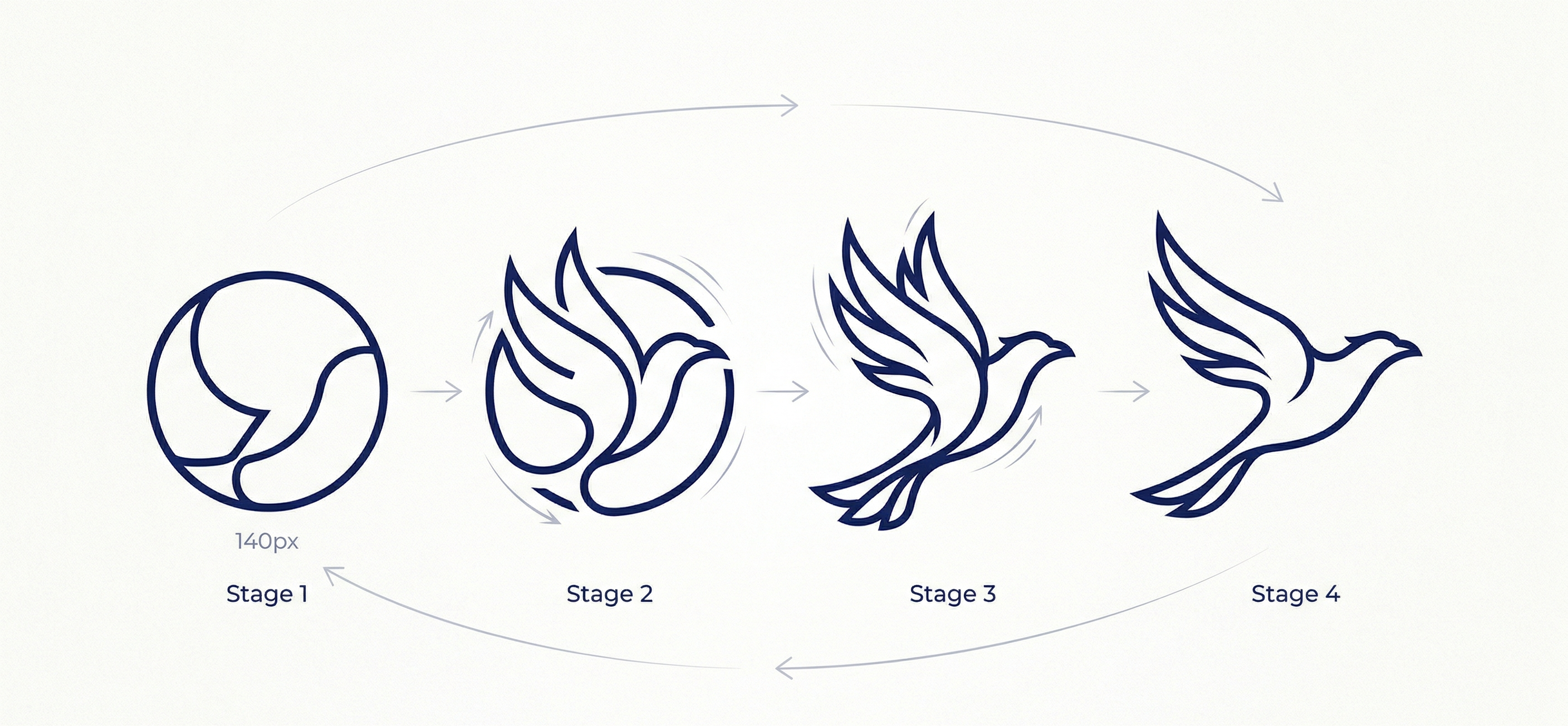
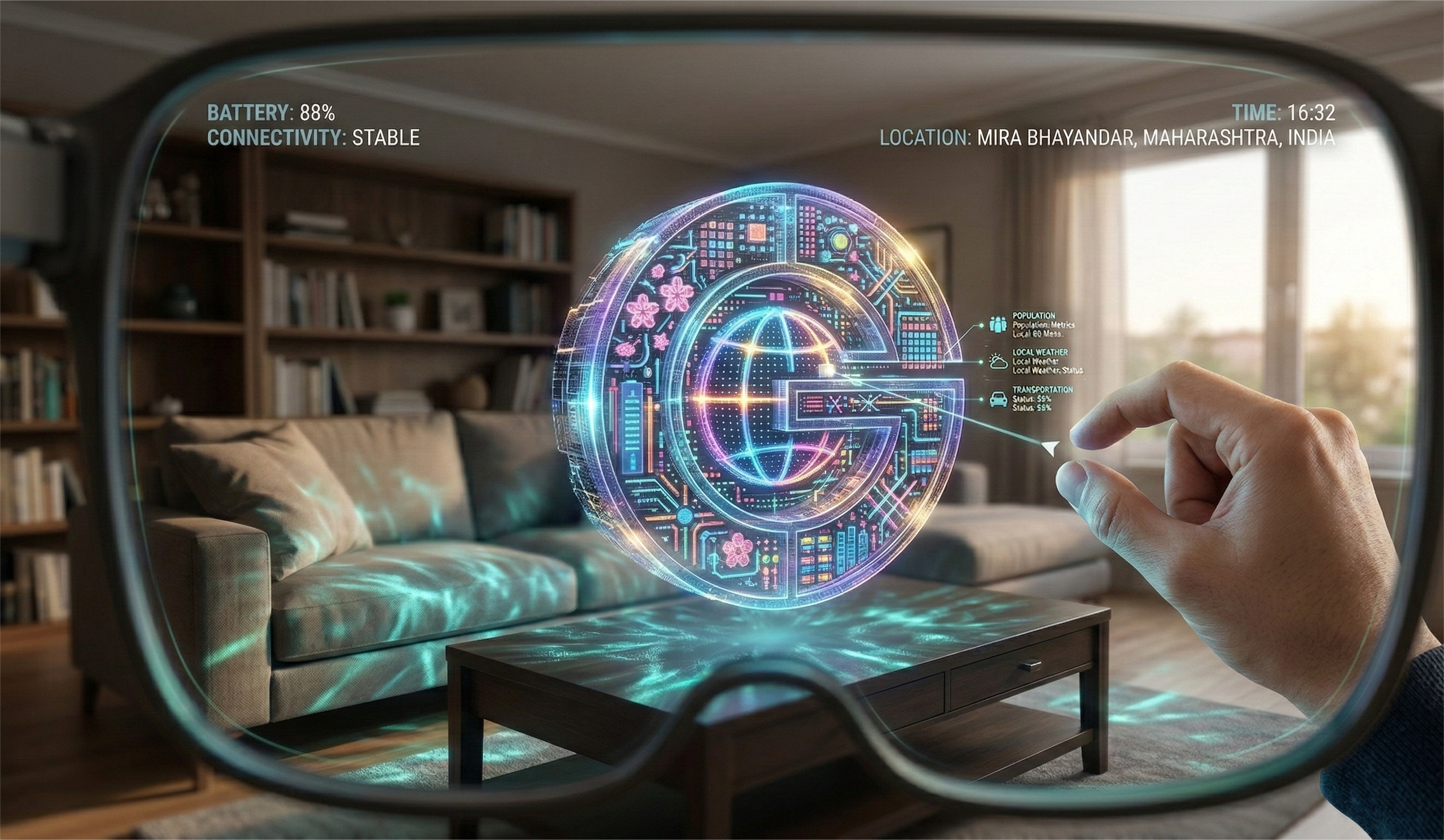
7. Spatial & Metaverse Branding (Z-Axis Logos)
With AR glasses replacing smartphones as the primary browsing device, your logo must exist in 3D space.
- Z-Axis Anchoring: A spatial logo isn't just a 2D image; it’s a 3D object that a user can walk around in a virtual environment.
- Visual Search Supremacy: Google Lens and other visual search tools can identify 3D logos with much higher accuracy, placing your brand at the top of AR search results.
- Immersive Engagement: By providing a 3D logo, you invite the user into a "Brand Universe," drastically increasing the conversion rates of your Brand Identity Design.
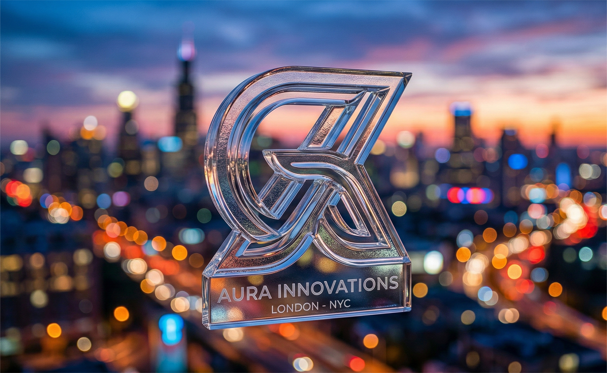
8. Typographic Heroism (The "Font-First" Logo)
In 2026, typography is more than just reading-it is a performance. Custom, variable fonts are the ultimate way to stand out from competitors.
- Uncopiable Identity: While icons can be mimicked by AI, a custom-designed typeface is a unique brand asset that cannot be easily replicated.
- Variable Readability: Our fonts automatically adjust their weight and spacing for better readability in high-glare or low-light situations, ensuring your Mobile App Development is always accessible.
- Emotional Voice: Typography carries the emotional weight of your brand voice; we craft fonts that speak with authority, empathy, or innovation depending on your goals.
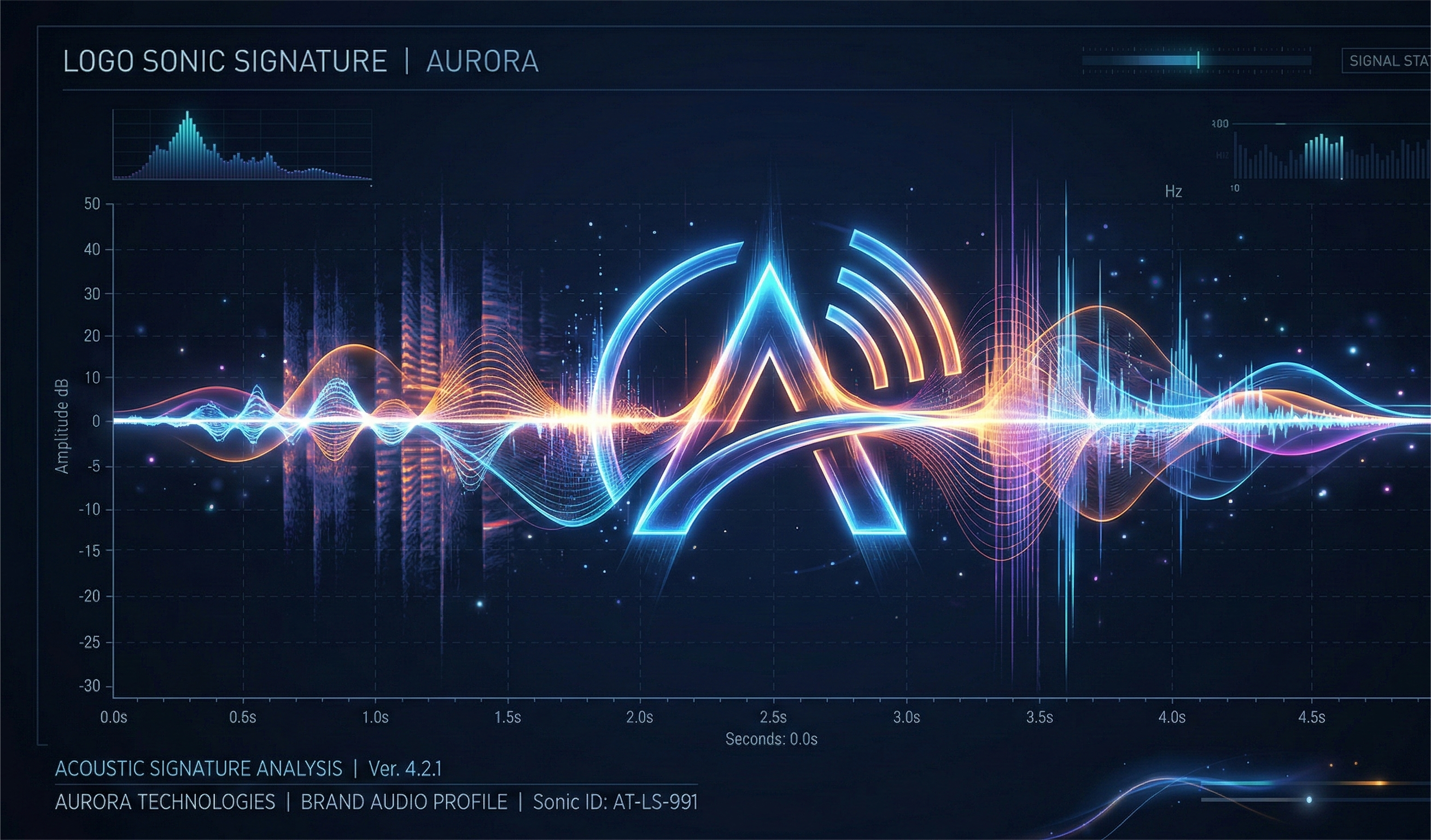
9. Haptic & Sonic Integration (The Sensory Logo)
The most successful brands of 2026 are those that users can "hear" and "feel" through their devices.
- The Sonic Signature: A 2-second audio cue associated with your logo builds brand recall that is 80% higher than visual marks alone.
- Tactile Feedback: On mobile devices, your logo should trigger a specific "haptic pulse" when tapped, making the digital experience feel premium and responsive.
- Voice Search Advantage: By having a "Sonic Brand," you prepare your business for the era of screen less search, where users identify brands by sound alone.
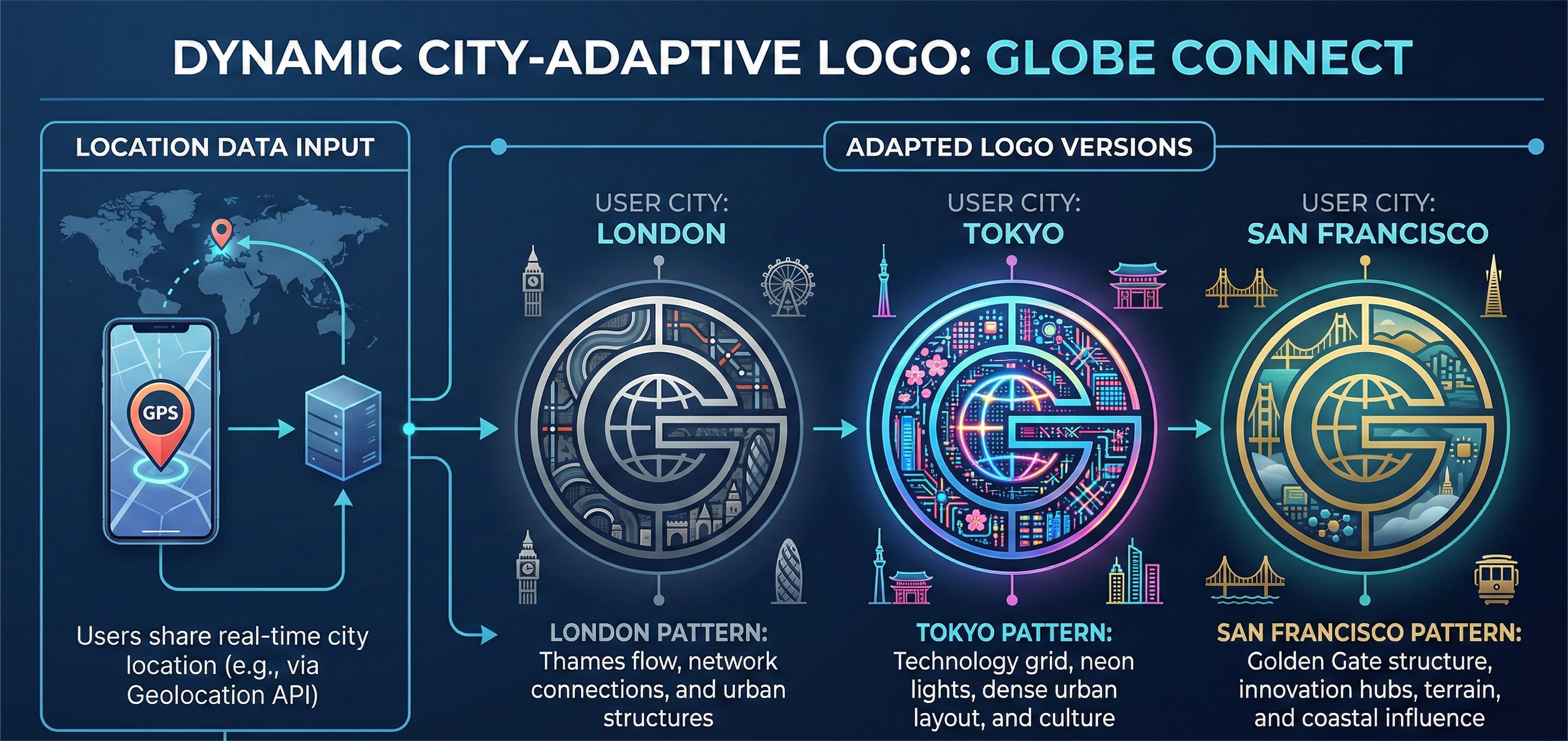
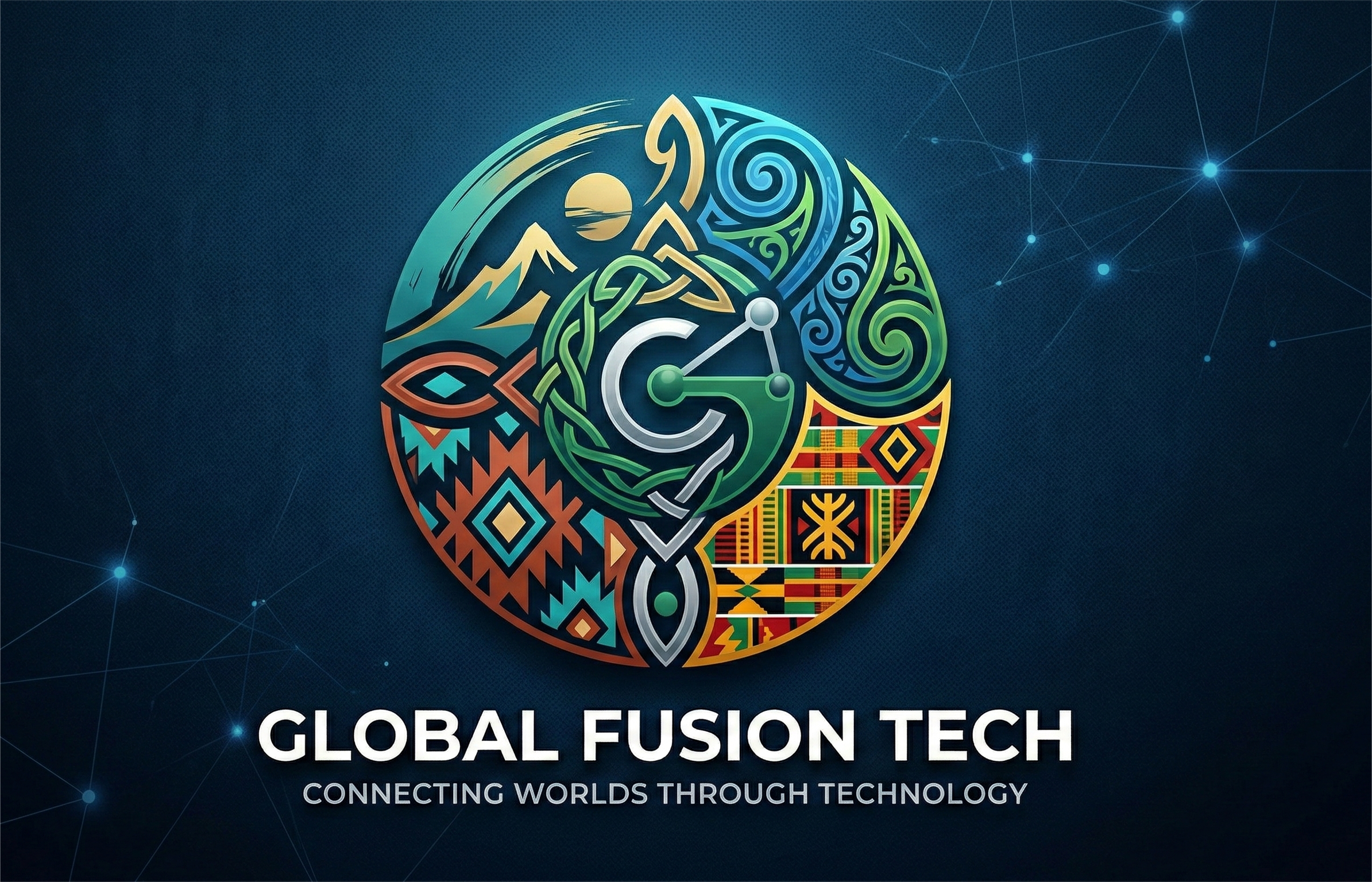
10. Globalized Localism (The Adaptive Identity)
In a global market, "Local SEO" is your secret weapon. Your logo must adapt to the cultural sensibilities of the person viewing it.
- Cultural Resonancy: We design modular logos that swap out colours or patterns based on the user's geographic location, making your brand feel like a "local hero."
- Global Authority: This approach allows you to maintain a global presence while building deep, localized trust in every market you enter.
- Search Contextualization: Google favour’s brands that show high relevance to local user intent; an adaptive logo is the ultimate signal of this relevance for your Digital Marketing strategy.
FAQ: Logo Design Trends 2026
Q: Why is my logo an SEO asset? In 2026, Google's "Visual Search" and "Experience" metrics are heavily influenced by the speed, responsiveness, and uniqueness of your branding assets.
Q: Can I update my logo without losing my brand equity? Absolutely. A "Brand Refresh" with Cinute Infomedia involves evolving your core elements into 2026 standards while keeping the recognizable "soul" of your identity intact.
Q: How do 3D logos affect mobile site performance? We use next-gen WebGL and Three.js optimization to ensure that 3D elements load as fast as standard images, keeping your Website Development scores in the green.
Conclusion: Building for the Next Decade
The Logo Design Trends 2026 represent a merger of art and algorithm. At Cinute Infomedia visual consistency and technical performance of your Brand Identity Design directly influence your organic visibility. We have the 25 years of experience required to ensure your brand doesn't just look pretty-it ranks, converts, and endures.
Related Articles
How to Run Microsoft Ads for SMBs Without Wasting Budget
One in four ad dollars vanishes on clicks that never convert. This guide shows SMBs how to run Microsoft Ads profitably without wasting a rupee of budget.
11 Proven Twitter Community Building Tactics for SMEs
Followers don't pay the bills communities do. Here are 11 proven Twitter community building tactics that turn passive SME audiences into loyal buyers.
How to Build White-Hat Links Without Penalties in 2026
Worried that link building is dead or risky in the AI-search era? This guide shows why white-hat link building still drives rankings and how to do it safely.