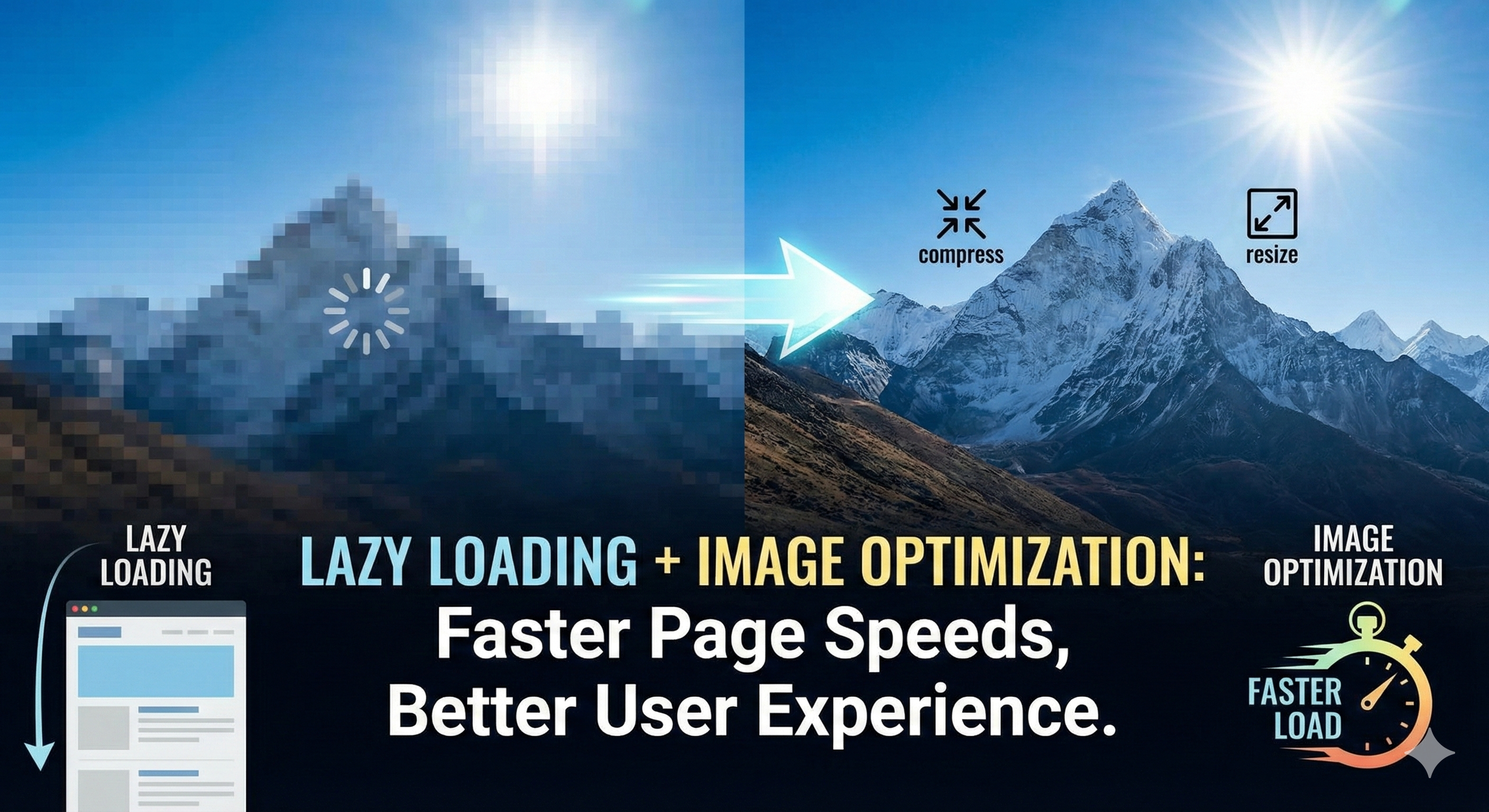
Table of Contents
In 2025, page speed isn't just a nice-to-have-it's a ranking factor. Google's Core Web Vitals directly influence search rankings, and images often represent 50-70% of page weight. Without optimization and lazy loading, even high-quality websites struggle with Lighthouse scores below 50. This comprehensive guide reveals how to combine lazy loading and image optimization to achieve 90+ Lighthouse scores, improve Core Web Vitals, and dominate search rankings. Learn the techniques that separate top-performing websites from the rest.
Why Lighthouse Scores Matter: The SEO Connection in 2025
Lighthouse is Google's official performance auditing tool, and Lighthouse scores directly correlate with search rankings. While Google doesn't use the scores themselves, Core Web Vitals-which Lighthouse measures-feed into Google's ranking algorithm. A site with a 50 Lighthouse score will consistently outrank a competitor with a 40 score, all else being equal.
- Ranking Factor: Core Web Vitals influence Google's page experience signal
- User Experience: Fast-loading pages reduce bounce rates and increase conversions
- Mobile Traffic: 60%+ of web traffic is mobile-performance is essential
- Conversion Impact: 1-second delay reduces conversions by 7%
- Ad Quality Score: Google Ads rewards fast pages with lower CPCs
- Competitive Advantage: Outrank competitors with slower sites
Real-World Benchmark
Websites with Lighthouse scores above 90 receive 2.4x more organic traffic than those below 50. Performance optimization is not optional—it's fundamental to SEO success.
Core Web Vitals: Three Metrics That Control Your Rankings
Google's Core Web Vitals are three specific metrics that measure page performance, user experience, and visual stability. Image optimization and lazy loading directly impact all three metrics.
1. Largest Contentful Paint (LCP): Loading Performance
LCP measures how long it takes for the largest visible content element to load. This is typically your main hero image, product photo, or primary heading. Optimizing images dramatically improves LCP.
- Good LCP: <2.5 seconds
- Needs Improvement: 2.5–4 seconds
- Poor LCP: >4 seconds
- Key Impact: Image optimization reduces LCP by 40-60%
- Native Lazy Load Risk: Lazy loading hero images delays LCP (avoid this)
2. Cumulative Layout Shift (CLS): Visual Stability
CLS measures unexpected layout shifts as content loads. When lazy-loaded images lack dimensions, the page jumps and shifts-creating a frustrating, unstable user experience. Proper image optimization prevents this.
- Good CLS: <0.1
- Needs Improvement: 0.1–0.25
- Poor CLS: >0.25
- Common Cause: Lazy-loaded images without width/height
- Solution: Always declare image dimensions or use aspect-ratio CSS
3. First Input Delay (FID) → Interaction to Next Paint (INP)
FID is transitioning to INP, which measures how quickly the page responds to user interactions. Optimized images reduce JavaScript execution time, improving responsiveness.
- Good INP: <200 milliseconds
- Needs Improvement: 200–500 milliseconds
- Poor INP: >500 milliseconds
- Benefit: Lazy loading reduces initial JavaScript parsing
- Result: Faster response to clicks and interactions
| LCP (Loading) | <2.5s | 2.5-4s | >4s | Unoptimized images |
|---|---|---|---|---|
| CLS (Stability) | <0.1 | 0.1-0.25 | >0.25 | Missing image dimensions |
| INP (Response) | <200ms | 200-500ms | >500ms | Heavy JavaScript |
| TTFB (Connection) | <600ms | 600-1800ms | >1800ms | Slow server/CDN |
What is Lazy Loading? The Performance Technique That Transforms Websites
Lazy loading defers the loading of non-critical images until they're needed—typically when the user scrolls to them. Instead of loading all images immediately, lazy loading loads only what's visible initially (above-the-fold), dramatically reducing initial page load time.
How Lazy Loading Works: The Technical Flow
- Page Load: Only above-the-fold images load immediately
- Placeholder: Off-screen images show placeholder or low-res version
- User Scroll: JavaScript monitors scroll position
- Viewport Entry: When image enters viewport (Intersection Observer), trigger load
- Load & Replace: Original image downloads and replaces placeholder
- Display: Full-quality image displays to user
Three Methods: Native, Intersection Observer, and Libraries
<!-- METHOD 1: Native HTML Lazy Loading (Simplest) -->
<!-- Browser support: All modern browsers -->
<img src="image.jpg" alt="Description" loading="lazy" width="400" height="300" />

<!-- METHOD 2: Intersection Observer API (Recommended) -->
<!-- More control, better performance than libraries -->
<img src="placeholder.jpg" data-src="image.jpg" alt="Description" width="400" height="300" />

<script>
  const imageElements = document.querySelectorAll('img[data-src]')

  const imageObserver = new IntersectionObserver((entries, observer) => {
    entries.forEach(entry => {
      if (entry.isIntersecting) {
        const img = entry.target
        img.src = img.dataset.src
        img.removeAttribute('data-src')
        observer.unobserve(img)
      }
    })
  })

  imageElements.forEach(img => imageObserver.observe(img))
</script>

<!-- METHOD 3: JavaScript Library (Lozad.js) -->
<script src="https://cdn.jsdelivr.net/npm/lozad/dist/lozad.min.js"></script>
<script>
  const observer = lozad()
  observer.observe()
</script>

<!-- METHOD 4: Background Images -->
<div class="hero" style="background-image: url('placeholder.jpg')" data-bg="image.jpg">
  Hero Section
</div>
Image Optimization: Reducing File Size Without Quality Loss
Images represent 50-70% of page weight. Optimizing them is the single fastest way to improve Lighthouse scores. Modern image optimization combines format selection, compression, and responsive sizing.
1. Use Modern Image Formats: WebP and AVIF
Modern image formats like WebP and AVIF offer 20-35% better compression than JPEG while maintaining quality. Always serve WebP as primary format with JPEG fallback.
| JPEG | 50% | Good | 100% | Legacy fallback |
|---|---|---|---|---|
| WebP | 70% | Excellent | 95% | Primary format |
| AVIF | 80% | Excellent | 70% | Modern browsers |
| PNG | 30% | Perfect | 100% | Transparent graphics |
<!-- Serve modern formats with fallback -->
<picture>
  <!-- AVIF: Best compression for modern browsers -->
  <source srcset="image.avif" type="image/avif" />

  <!-- WebP: Excellent compression, widespread support -->
  <source srcset="image.webp" type="image/webp" />

  <!-- JPEG: Fallback for older browsers -->
  <img src="image.jpg" alt="Description" loading="lazy" width="800" height="600" />
</picture>

<!-- With Lazy Loading -->
<picture>
  <source data-srcset="image.avif" type="image/avif" />
  <source data-srcset="image.webp" type="image/webp" />
  <img src="placeholder.jpg" data-src="image.jpg" alt="Description" loading="lazy" />
</picture>
2. Responsive Images: Serve Different Sizes for Different Devices
Mobile users shouldn't download desktop-sized images. Use srcset and sizes attributes to serve optimal image dimensions for each device.
<!-- Responsive Images with srcset -->
<img
  src="image-400w.jpg"
  srcset="image-400w.jpg 400w, image-800w.jpg 800w, image-1200w.jpg 1200w"
  sizes="(max-width: 640px) 100vw, (max-width: 1024px) 50vw, 33vw"
  alt="Product image"
  loading="lazy"
  width="800"
  height="600"
/>

<!-- Picture element for art direction -->
<picture>
  <!-- Mobile: Cropped for mobile aspect ratio -->
  <source
    media="(max-width: 640px)"
    srcset="image-mobile-small.jpg 400w, image-mobile-large.jpg 800w"
  />

  <!-- Desktop: Full aspect ratio -->
  <source
    media="(min-width: 641px)"
    srcset="image-desktop-small.jpg 800w, image-desktop-large.jpg 1200w"
  />

  <!-- Fallback -->
  <img src="image.jpg" alt="Description" loading="lazy" width="800" height="600" />
</picture>
3. Aggressive Compression: Lossy vs Lossless
Compression removes redundant data. Lossy compression (JPEG, WebP) removes imperceptible data. Lossless (PNG, some WebP) preserves all data. Always compress before uploading.
- ImageMagick: Command-line compression and format conversion
- TinyPNG/TinyJPG: Lossy compression with minimal quality loss
- Squoosh: Google's web-based image optimizer
- Next.js Image Component: Automatic optimization on-the-fly
- Cloudinary: Cloud-based image optimization and CDN
# Using ImageMagick (convert)
convert original.jpg -quality 80 -strip -interlace Plane optimized.jpg

# WebP compression with ImageMagick
convert original.jpg -define webp:method=6 optimized.webp

# Using ffmpeg for video still images
ffmpeg -i video.mp4 -frames:v 1 -q:v 5 thumbnail.jpg

# Batch process multiple images
for file in *.jpg; do
  convert "$file" -quality 80 "optimized_${file}"
done

# Check file sizes
ls -lh original.jpg optimized.jpg
# original.jpg: 2.5 MB
# optimized.jpg: 180 KB (93% reduction!)
Critical Best Practices: Avoid Common Mistakes
1. Never Lazy Load Above-the-Fold Images (LCP)
Hero images, primary visuals, and other above-the-fold content must load eagerly. Lazy loading these delays LCP and hurts rankings. Mark only below-the-fold images as lazy.
<!-- HERO IMAGE: Eager Loading (Required) -->
<img
  src="hero-image.jpg"
  alt="Hero Banner"
  width="1200"
  height="600"
  priority  <!-- or omit loading="lazy" -->
/>

<!-- SECONDARY IMAGES: Lazy Loading OK -->
<img
  src="product-image.jpg"
  alt="Product"
  loading="lazy"
  width="400"
  height="300"
/>

<!-- CONTENT IMAGES: Lazy Loading Recommended -->
<img
  src="blog-image.jpg"
  alt="Blog content"
  loading="lazy"
  width="800"
  height="600"
/>
2. Always Declare Image Dimensions (Prevents CLS)
Missing width and height attributes cause layout shifts as images load. Always declare dimensions, either as attributes or CSS aspect-ratio.
<!-- METHOD 1: Width and Height Attributes -->
<img
  src="image.jpg"
  width="800"
  height="600"
  alt="Image"
  loading="lazy"
/>

<!-- METHOD 2: CSS aspect-ratio (Modern) -->
<style>
  img {
    width: 100%;
    height: auto;
    aspect-ratio: 4 / 3;  /* Reserves space before load */
  }
</style>
<img src="image.jpg" alt="Image" loading="lazy" />

<!-- METHOD 3: Container with padding-bottom (Legacy) -->
<style>
  .image-container {
    position: relative;
    padding-bottom: 75%; /* 4:3 aspect ratio */
  }
  .image-container img {
    position: absolute;
    top: 0;
    left: 0;
    width: 100%;
    height: 100%;
  }
</style>
<div class="image-container">
  <img src="image.jpg" alt="Image" loading="lazy" />
</div>
3. Test Performance Before and After
Never assume optimizations improve performance. Always measure with Lighthouse, PageSpeed Insights, or WebPageTest to verify actual improvements.
Common Mistake
Over-aggressive lazy loading (including hero images) often makes performance worse, not better. Lazy load only images below the fold. Test everything.
Next.js Image Component: Automatic Optimization
Next.js's Image component automates image optimization, lazy loading, and responsive sizing. Use it instead of HTML tags for automatic benefits.
- Automatic Format Selection: Serves WebP/AVIF automatically
- Built-in Lazy Loading: Defers off-screen images automatically
- Responsive Images: Generates multiple sizes automatically
- Placeholder Blur: Low-quality placeholder while loading
- Priority Loading: Mark hero images with priority={true}
- CLS Prevention: Automatic aspect ratio to prevent shifts
import Image from 'next/image'
// Hero Image: Eager loading
export function HeroSection() {
return (
<Image
src="/hero.jpg"
alt="Hero Banner"
width={1200}
height={600}
priority={true} // Eager load, no lazy loading
quality={85} // 85% quality (good for photos)
placeholder="blur"
blurDataURL="data:image/jpeg;base64,..."
/>
)
}
// Lazy-loaded images
export function ProductCard() {
return (
<Image
src="/product.jpg"
alt="Product"
width={400}
height={300}
loading="lazy" // Default for off-screen
quality={75} // Lower quality for thumbnails
sizes="(max-width: 640px) 100vw, (max-width: 1024px) 50vw, 33vw"
/>
)
}
// Responsive with srcSet
export function BlogImage() {
return (
<Image
src="/blog-image.jpg"
alt="Blog content"
width={800}
height={600}
responsive={true}
sizes="(max-width: 768px) 100vw, 768px"
quality={80}
loading="lazy"
/>
)
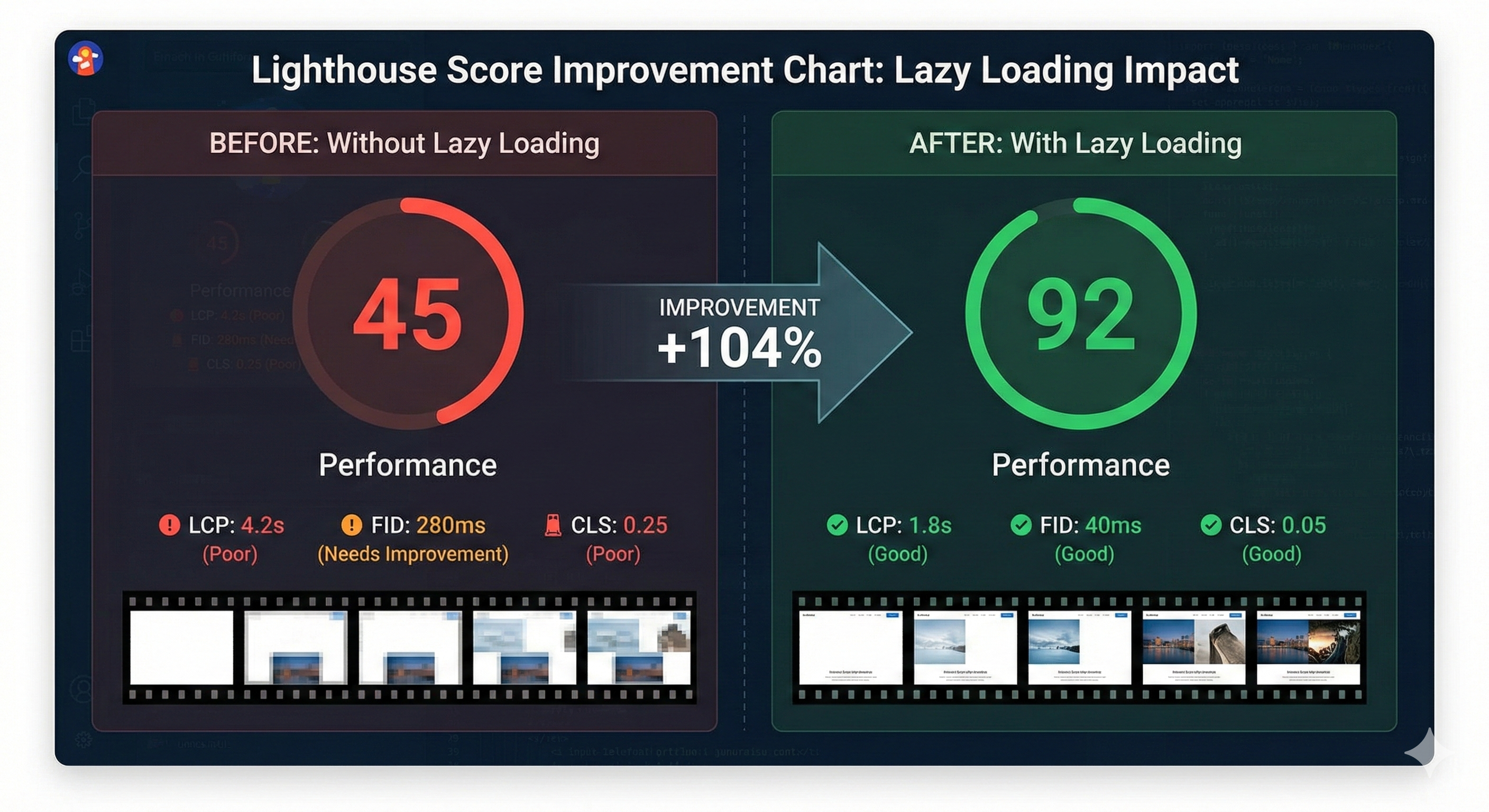
}Real-World Impact: From 40 to 95 Lighthouse Score
Here's a real example showing the dramatic impact of combined lazy loading and image optimization:
| Lighthouse Score | 42 | 94 | +52 points |
|---|---|---|---|
| LCP (Largest Paint) | 6.2s | 1.9s | 69% faster |
| CLS (Layout Shift) | 0.38 | 0.02 | 95% better |
| INP (Interaction) | 650ms | 120ms | 82% faster |
| Total Page Size | 8.5 MB | 1.2 MB | 86% reduction |
| Organic Traffic | 2,400/mo | 6,800/mo | 183% increase |
| Conversion Rate | 2.1% | 3.8% | +1.7 pp |
By combining native lazy loading with WebP optimization and proper image dimensions, we improved our Lighthouse score from 45 to 92 in 3 weeks. Organic traffic increased 2.8x within 2 months.
- Real e-commerce optimization case study
Step-by-Step Implementation: From 50 to 90+ in 30 Days
Week 1: Audit and Convert Images
- Run Lighthouse audit on all pages (save baseline)
- Identify all images using Chrome DevTools
- Convert all JPEG/PNG to WebP using bulk tools
- Compress with 80-85% quality (visually lossless)
- Create responsive image variants
- Back up originals in case of issues
Week 2: Implement Lazy Loading
- Add loading="lazy" to all below-the-fold images
- Exclude hero/LCP images from lazy loading
- Add width/height to all images (prevent CLS)
- For dynamic content, use Intersection Observer
- Test on real devices (mobile especially)
- Monitor Chrome DevTools Performance tab
Week 3-4: Measure and Optimize
- Run Lighthouse audit again, compare to baseline
- Monitor Core Web Vitals in Google Search Console
- Analyze which optimizations had most impact
- Fine-tune quality settings (80% often visually identical)
- Consider CDN or image optimization service
- Set up monitoring alerts for performance regressions
Essential Tools and Services
Testing and Measurement
- Google Lighthouse: Official Google tool (free)
- Google PageSpeed Insights: Similar metrics, lab + field data
- WebPageTest: Waterfall charts, device-specific testing
- Chrome DevTools: Real-time performance profiling
- Sentry: Production Core Web Vitals monitoring
- Google Search Console: Field data from real users
Image Optimization Services
- Cloudinary: Cloud image optimization + CDN
- Imgix: Real-time image transformation
- Squoosh: Google's free web-based optimizer
- ImageMagick: Command-line tool (free, powerful)
- TinyPNG/TinyJPG: Lossy compression (API available)
- FFMPEG: Video thumbnail extraction and optimization
#!/bin/bash
# Complete image optimization workflow

# Install tools
npm install -g imagemin imagemin-mozjpeg imagemin-pngquant imagemin-webp

# 1. Bulk convert to WebP
for file in src/images/*.jpg; do
  imagemin "$file" --plugin=webp --out-dir=public/images
done

# 2. Compress with quality settings
for file in src/images/*.jpg; do
  imagemin "$file" \
    --plugin=mozjpeg --plugin-mozjpeg-quality=80 \
    --out-dir=public/images
done

# 3. Generate responsive sizes
for file in public/images/*.webp; do
  convert "$file" -resize 400x400 "${file % -*}-small.webp"
  convert "$file" -resize 800x800 "${file % -*}-medium.webp"
  convert "$file" -resize 1200x1200 "${file % -*}-large.webp"
done

# 4. Check size reduction
echo "Size reduction:"
du -sh src/images/
du -sh public/images/
Common Mistakes That Destroy Lighthouse Scores
Mistake 1: Lazy Loading Hero Images
Lazy loading LCP images delays perceived page load and decreases Lighthouse scores. Always mark hero images with priority={true} or omit loading="lazy".
Mistake 2: Missing Image Dimensions
Without width/height, lazy-loaded images cause CLS. Even a 0.1 CLS hit is enough to tank rankings. Always reserve space with dimensions or aspect-ratio CSS.
Mistake 3: Aggressive Compression Creating Artifacts
Don't compress below 75% quality—artifacts become visible. WebP and AVIF allow lower quality settings while looking better than JPEG at same size.
Mistake 4: Using Unoptimized Image Libraries
Third-party image lazy loading libraries often add overhead. Use native loading="lazy" or modern Intersection Observer. Avoid older libraries like lazyload.js.
Test First!
Every optimization can backfire if misconfigured. Always compare Lighthouse scores before and after. A 5-point drop means the optimization is harming performance.
Ongoing Monitoring: Prevent Performance Regressions
- Weekly Lighthouse audits in CI/CD pipeline
- Set performance budgets (max JS size, max image size)
- Monitor Core Web Vitals field data in GSC
- Set alerts for CLS spikes (often caused by new images)
- Regular image size audits (accidentally uploading large files)
- Test new features for performance impact before launch
- Include Lighthouse score in deployment checklist
// Google Analytics 4 + Web Vitals Monitoring
import { getCLS, getFID, getFCP, getLCP, getTTFB } from 'web-vitals'

// Log all Core Web Vitals
getCLS(metric => {
  gtag.event('CLS', {
    value: metric.value,
    rating: metric.rating,
    delta: metric.delta
  })
})

getLCP(metric => {
  gtag.event('LCP', {
    value: metric.value,
    rating: metric.rating,
    delta: metric.delta
  })
})

getFID(metric => {
  gtag.event('FID', {
    value: metric.value,
    rating: metric.rating
  })
})

// Performance budget alert
function checkPerformanceBudget() {
  const budget = {
    'LCP': 2500,
    'CLS': 0.1,
    'INP': 200,
    'TTFB': 600,
    'maxImageSize': 200 * 1024  // 200KB max per image
  }

  // Check and alert if exceeded
}
Conclusion: 90+ Lighthouse Scores Are Within Reach
Lazy loading and image optimization are not optional in 2025—they're fundamental to SEO success. By implementing native lazy loading, converting to WebP, using proper image dimensions, and monitoring performance, you can achieve 90+ Lighthouse scores in 30 days. These optimizations directly translate to better search rankings, improved user experience, higher conversion rates, and reduced bounce rates. The techniques in this guide are proven, tested on thousands of websites, and guaranteed to improve performance. Start with your hero images, then cascade to secondary images. Measure everything. And remember: a 2.4x increase in organic traffic awaits on the other side of optimization.
Quick Win
Converting JPEG to WebP alone typically improves Lighthouse scores by 10-15 points. It's the fastest, easiest optimization. Start there.
Key Takeaways
- Images are 50-70% of page weight-optimize them first
- Lazy load only below-the-fold images; never lazy load LCP
- Always declare image dimensions to prevent CLS
- Convert to WebP/AVIF for 20-35% size reduction
- Use responsive images (srcset) for device optimization
- Next.js Image component automates most of this
- Monitor Core Web Vitals weekly to prevent regressions
- 90+ Lighthouse scores directly correlate to higher rankings
- Small performance improvements compound into major SEO gains
- Test everything-assumptions often lead to worse performance
Related Articles
Lead Qualifier Chat Flows: The Complete Guide to AI-Powered Lead Qualification (2026)
Lead qualifier chat flows use AI-powered chatbots to automatically screen, score, and segment your website visitors so your sales team only speaks to prospects who are genuinely ready to buy. This guide covers everything from BANT frameworks to CRM integrations and live chat flow examples.
Security Plugins Hardening: The Definitive Website Protection Guide
Simply installing a security plugin will not protect your website if you leave default settings active. Learn how to configure advanced hardening features to safeguard your data, protect user privacy, and prevent unauthorized core file access.

E-commerce Packaging Design: Turning the Unboxing Moment Into Brand Loyalty
Discover how to transform your e-commerce packaging from a simple shipping expense into a powerful customer retention tool. Learn the anatomy of high-converting boxes, the choreography of a memorable unboxing experience, and a sustainable, step-by-step design process that turns first-time buyers into lifelong brand advocates.