
Table of Contents
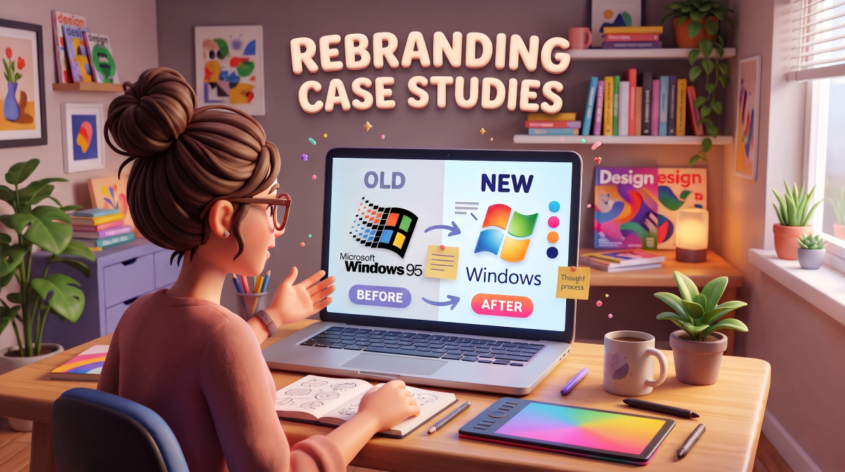
Rebranding case studies show what happens when a company changes its name, logo, message or look in public. Some rebrands lift growth and trust. Others trigger backlash and a quick rollback. This guide walks through six real examples, four wins and two stumbles, in plain language. You also get a simple checklist, plus SEO tips so your traffic survives the change. It is written for CTOs, product managers, developers, testers and digital marketers.
What Is a Rebrand, and Why Do Companies Do It?
A rebrand is a planned change to how a company looks, sounds and presents itself. It can be small, like a logo refresh, or big, like a new name, a new audience and a new product story. Experts usually split it into two types:
- Brand refresh: The strategy stays the same, but the look changes. Think updated colours, fonts and logo.
- Full rebrand: The positioning changes. The company shifts who it serves, what it promises or what it is called.
Companies rebrand for a few common reasons. The product has outgrown the old story. They entered a new market. They merged with another company. Or the old identity feels dated and confusing. Many tech companies also rebrand when they grow from a single product into a platform.
A good rebrand is not decoration. It is a business decision backed by research. That is why rebranding case studies are so useful: they show the thinking behind the visuals. If you want help turning strategy into a clear identity, the brand identity and design services at Cinute InfoMedia (CIM) cover logos, style guides and complete visual systems.
Case Study 1: Airbnb and the Idea of Belonging
In 2014, Airbnb replaced its simple wordmark with a symbol called the Bélo. The company said the shape stood for belonging, and it tied the change to a bigger idea: a trip is not just a room, it is the feeling of being at home anywhere.
The first reaction was messy. Many people mocked the logo online and compared its shape to unrelated things. Yet the idea behind it held up. Airbnb used the symbol, a clear story and consistent design across its website, app and host materials. Over time the criticism faded and the symbol became a core part of the brand. One published case study reports that the company's valuation roughly doubled within a couple of years, although many factors drove that growth.

Lesson for tech teams: Anchor your rebrand in a story users can repeat in one sentence. A logo alone does not carry a business, but a clear idea behind it does. Early noise on social media is normal. Judge the result by retention and bookings, not by the first day of comments.
Case Study 2: Instagram Kept the Idea and Changed the Look
In 2016, Instagram dropped its retro camera icon for a flat glyph with a bright gradient. The change was highly visible to hundreds of millions of people. Yet it worked because the team kept the concept: a camera, a lens and a flash, just simplified. Reviewers of this case often point out that Instagram preserved the core idea while it changed the execution.
The old icon belonged to an era when apps copied real-world objects. As Instagram grew into video, stories and messaging, a literal camera felt too narrow. The new design matched the flat style of modern phones and gave the brand room to grow.
Lesson: If your product has grown, update the symbol to match, but keep one visual clue people already recognize. Familiarity lowers the shock.
Developers and testers should note one practical detail. An icon change touches app stores, in-app assets, splash screens, push notification icons and web favicons. Missing even one creates an inconsistent experience. Add a full asset audit to your QA plan.
Case Study 3: Slack and the Logo Users Did Not Like
In early 2019, Slack replaced its multicolour hash-style logo with a new mark built from speech-bubble shapes. The goal was a simpler symbol that stayed consistent in small sizes and across more products. The reaction was sharp. Many users felt the new logo looked less friendly and was harder to recognize. Marketing blogs still use it as an example of a rebrand that met public pushback.

Slack did not reverse the decision. With time, people got used to the new mark, and the product kept growing as a workplace platform. The story shows that visible backlash does not always mean failure, especially when the business reasons behind the change are sound.
Lesson: Test your new identity with real users before launch, and prepare a response plan for the first week. Slack's case also reminds B2B teams that product users build an emotional link to small details like colour. Treat that link with respect.
Case Study 4: Mastercard Simplified a Global Icon
Mastercard's two overlapping circles have been part of its identity for decades. In 2016, the company simplified the design with cleaner colours and a flatter look. In 2019, it went further and removed its name from the symbol in many uses, letting the circles stand alone. Design reviews describe this as a move toward a brand that works well on screens, in apps and on small devices.
The change worked because people already knew the circles. Mastercard did not need to explain the symbol. It only needed to trim the extra parts.
Lesson: Strong brands can afford to remove elements, but only after they have built recognition. If your brand is new, keep your name visible. If it is established, test how little your logo needs to say.
Marketers should note the digital angle too. A simple symbol loads fast, fits tiny placements and scales across display ads, social avatars and mobile wallets. Simple, flexible assets also make creative testing easier, which is why teams running performance marketing campaigns value them.
Case Study 5: Gap and the Logo That Lasted One Week
In 2010, Gap unveiled a new logo that swapped its classic blue box for a modern font with a small gradient square. The reaction online was fast and negative, and the company returned to its original logo within about a week. Marketing classes still cite it as a warning.

What went wrong? The change arrived without a clear reason or story, and customers were not prepared for it. Social media magnified every complaint. The effort to invite public input only after launch looked like a lack of confidence.
Lesson: A rebrand without a reason is only a cosmetic change, and cosmetic changes rarely survive loud criticism. Share the why along with the what, and test with real customers first.
Case Study 6: Tropicana and the Packaging That Hurt Sales
In 2009, Tropicana redesigned its orange juice cartons. The classic orange with a straw was replaced by a clean, minimal look. Widely reported figures say sales fell sharply within weeks, and the company went back to the old packaging soon after.
Shoppers had relied on the old picture to find the product on a crowded shelf. Without it, the carton looked like any other. The brand lost its quick visual cue.
Lesson: Identify which brand assets customers use to find you, whether that is a color, a shape or a word, and protect them. For tech brands, this might be a name in search results, an app icon on a home screen or a domain customers already trust.
Quick Comparison of the Six Rebranding Case Studies
| Brand | Year | Main change | Result | Core lesson |
|---|---|---|---|---|
| Airbnb | 2014 | New symbol and "belonging" story | Backlash first, then wide acceptance | Lead with a clear idea |
| 2016 | Flat icon with gradient | Accepted widely | Keep one familiar clue | |
| Slack | 2019 | New speech-bubble mark | Pushback, then adoption | Test and prepare a response |
| Mastercard | 2016, 2019 | Simpler circles, name removed | Smooth transition | Simplify only after recognition |
| Gap | 2010 | New logo | Reversed in about a week | Explain the reason |
| Tropicana | 2009 | Minimal carton | Reportedly reversed after sales fell | Protect recognition cues |
A Simple 7-Step Rebranding Checklist for Tech Teams
Use these steps to turn the lessons above into a plan.
- Define the business reason. Write one sentence: why now, and for whom? Without it, the rebrand is only cosmetic.
- Run a brand audit. List every place your name, logo, colours and tone appear, from product screens to email footers and legal pages.
- Research your audience. Talk to customers and test early concepts. Ask what they recognize and what they trust.
- Build a design system. Document colours, type, icons and voice in one guide so every team uses the same rules.
- Update your digital home. Your website is where most people meet the new brand first. A web design and development team can roll out the new identity across templates, components and pages without breaking speed or accessibility.
- Update your support layer. Chatbots, help articles and email replies should all use the new name and tone. An AI-powered chatbot is a good example: update its greeting, voice and links on launch day.
- Launch, measure and listen. Track traffic, sign-ups, support tickets, brand search and social sentiment for at least 90 days.

How a Rebrand Affects SEO
Many teams forget that a rebrand can hurt search visibility. A new name, new URLs or a new domain can cause ranking drops if the move is not handled with care. Search engines need time to understand that the new brand is the same business as the old one.
Keep these basics in mind:
- Use 301 redirects. Map every old URL to the best matching new URL. Avoid sending everything to the homepage.
- Keep content and structure stable. Change the brand layer first, not the whole site structure at once.
- Update titles, headings and schema. Replace the old brand name in page titles, meta descriptions and structured data.
- Fix internal links and canonical tags. Broken or outdated links waste crawl budget and confuse search engines.
- Update external profiles. Change the name on social accounts, directories and review sites, then ask partners to update their links.
- Monitor in Search Console. Watch indexing, errors and brand-name queries every week after launch.
A proper technical SEO audit before and after launch catches most of these problems early. For the wider plan, from keyword mapping to content, CIM's SEO services are built to protect and grow organic traffic during a brand change. You can also see how the team approaches organic growth in the Testriq QA Lab case study.
Common Rebranding Mistakes to Avoid
- Changing for the sake of change. Without a clear reason, users see only a cosmetic update.
- Ignoring existing recognition. The Tropicana case shows how fast shoppers can lose a product they once found easily.
- Skipping user testing. Gap and Slack both show how loud early reactions can be.
- Forgetting internal teams. Employees are your first brand ambassadors. Explain the change to them before the public sees it.
- Launching without a technical plan. Missed redirects, old assets and broken links are the most common issues developers and testers face.
- Judging success on day one. Brands need weeks, not hours, to settle in. Measure over time.

Final Thoughts
The best rebranding case studies share the same pattern. Airbnb had a story. Instagram kept a familiar clue. Mastercard simplified only after it had earned recognition. The weaker examples, Gap and Tropicana, changed visible assets without a clear reason or enough testing.
For tech teams, the message is simple: treat a rebrand like a product launch. Define the goal, test with real users, plan the technical rollout, protect your search visibility and measure what happens next.
Planning a rebrand, a new website or a fresh identity for your product? Talk to the Cinute InfoMedia team for a free digital audit and a clear plan to launch with confidence.
Related Services
Related Articles
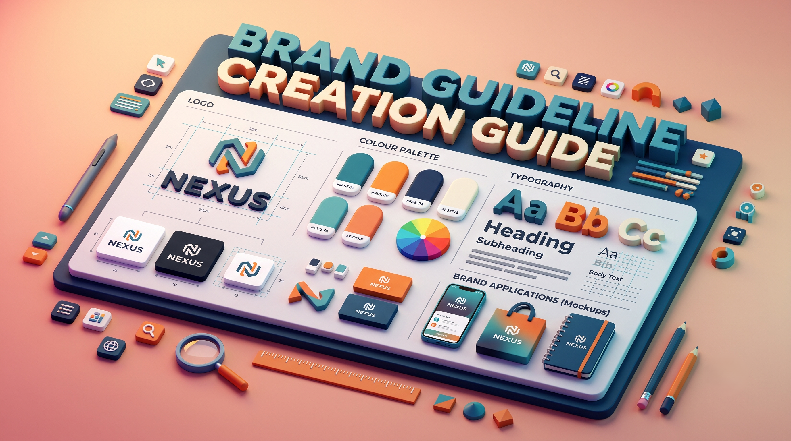
Brand Guideline Creation: A Step-by-Step Guide for Tech Brands
Brand guideline creation turns your logo, colours, fonts and voice into one clear rulebook for designers, developers, testers and marketers. This easy guide covers the core components, an 8-step process, design tokens for code, and how to connect your brand to SEO and AI.
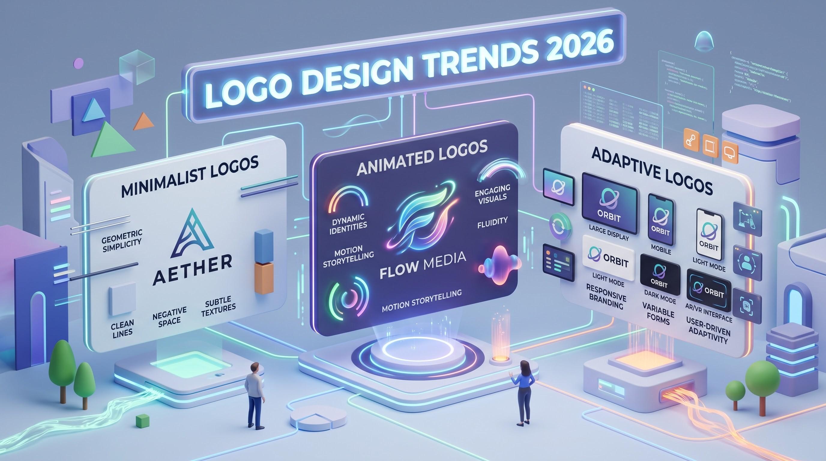
Logo Design Trends 2026: 8 Ways Tech Brands Are Rethinking Their Identity
Logos now work like small pieces of software. Discover the 8 logo design trends of 2026, from adaptive systems to motion and dark-mode palettes, plus a technical checklist for developers and marketers.
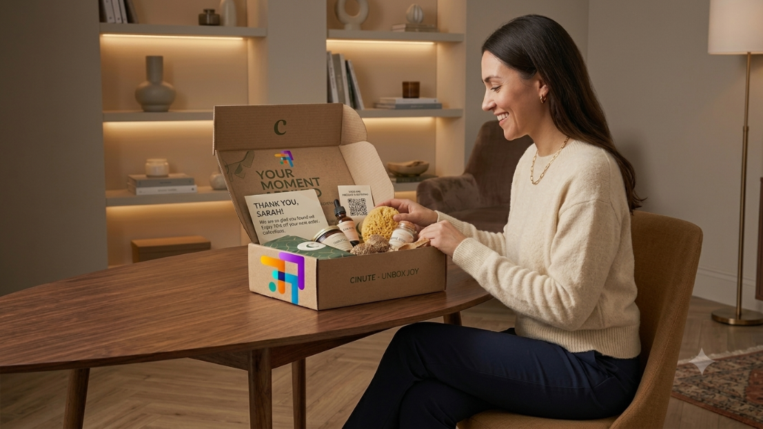
E-commerce Packaging Design: Turning the Unboxing Moment Into Brand Loyalty
Discover how to transform your e-commerce packaging from a simple shipping expense into a powerful customer retention tool. Learn the anatomy of high-converting boxes, the choreography of a memorable unboxing experience, and a sustainable, step-by-step design process that turns first-time buyers into lifelong brand advocates.