
Table of Contents
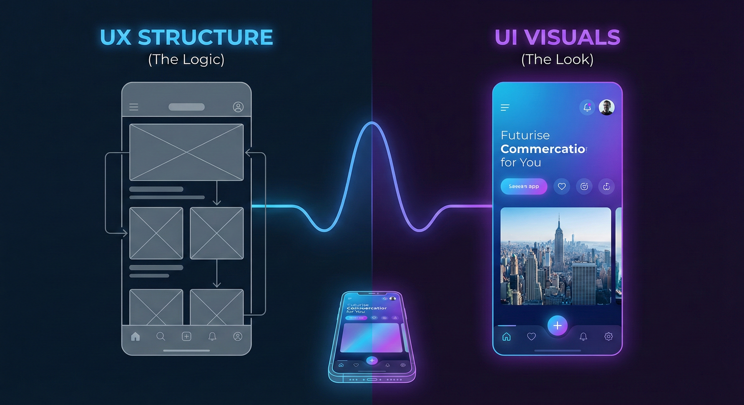
In the digital ecosystem of 2026, a user’s attention span is measured in milliseconds. When a potential client lands on your platform, you have roughly 0.05 seconds to make a first impression. This is where the art of UI/UX Design becomes not just a creative endeavour, but a critical business strategy. While many confuse the two, User Interface (UI) is the bridge—the buttons, colours, and layout—while User Experience (UX) is the journey—how the user feels as they walk across that bridge .
For businesses aiming to scale, investing in exceptional design is non-negotiable. A stunning interface may attract a user, but a seamless experience keeps them there. Whether you are building a complex enterprise platform or a simple consumer app, the principles remain the same: clarity, consistency, and user-centricity. In this extensive guide, we will dismantle the complexities of digital product design, offering you actionable best practices that go beyond aesthetics to drive engagement, lower bounce rates, and ultimately, increase conversions.
Chapter 1: The Symbiosis of UI and UX
To create a "stunning" design, one must first understand that UI and UX are two halves of the same whole.
The Visual Language (UI)
UI is the sensory aspect of your product. It is what the user sees. It involves the strategic use of typography, colour theory, and whitespace. A common mistake in web development is prioritizing "flashy" elements over readability. High-contrast buttons and legible fonts are not boring; they are accessible.
The Structural Logic (UX)
UX is the scientific backbone. It is what the user does. It involves information architecture, user flows, and interaction design. Good UX is invisible; the user shouldn't have to think about how to navigate from the homepage to the checkout.
Pro Tip: A beautiful interface with poor usability is like a Ferrari without an engine—it looks great, but it won’t take you anywhere.
Chapter 2: Core Principles of High-Converting Design
1. Clarity is King
The number one rule in UI/UX is to remove cognitive load. Do not make the user guess. Icons should be universal (a magnifying glass for search, a house for home). If you are offering custom software development, your dashboard shouldn't look like a cockpit; it should be intuitive enough for a non-technical user to navigate.
2. Consistency Builds Trust
Imagine walking into a room where every door handle works differently. It would be frustrating. The same applies to digital design. Your fonts, button styles, and spacing must be consistent across every page. This "Design System" approach ensures that once a user learns how to use one part of your site, they know how to use the rest.
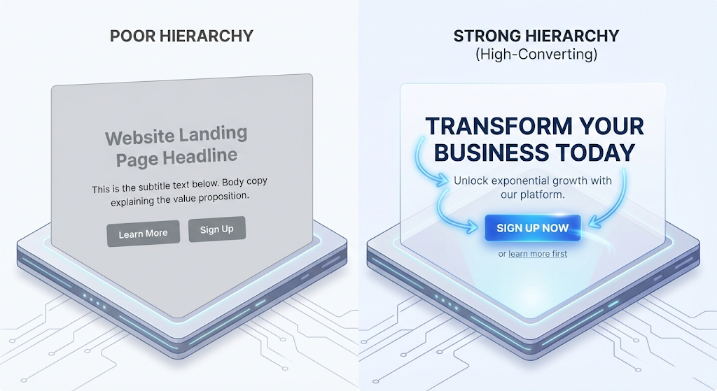
3. The Law of Hierarchy
Not all information is equal. You must use visual hierarchy to guide the user's eye.
- H1 Headers: The most important information.
- Bold Colours: For "Call to Action" (CTA) buttons like "Sign Up" or "Buy Now."
- Muted Text: For secondary information like footers or timestamps.
Chapter 3: The "Mobile-First" Imperative
With over 60% of global web traffic coming from mobile devices, designing for the desktop first is a relic of the past. Mobile-First Design means starting your design process with the smallest screen in mind.
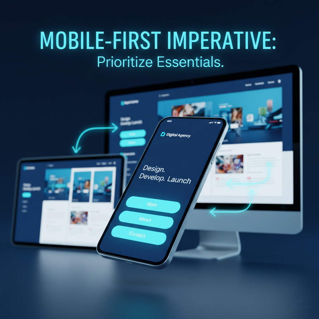
This approach forces you to prioritize. You don't have room for fluff on a smartphone screen. You must decide what is absolutely essential. This discipline often leads to cleaner, faster, and more efficient designs on larger screens as well. This is particularly vital in mobile application development, where thumb-reach zones and gesture controls (swiping, pinching) define the entire experience.
Chapter 4: The Role of Micro-Interactions
Stunning design lies in the details. Micro-interactions are subtle animations that provide feedback to the user.
- The button changing colour when you hover over it.
- The "pull-to-refresh" animation on your news feed.
- The satisfying "check" mark when a form is submitted successfully.
These tiny moments delight the user and confirm that the system is working. They make the digital environment feel "alive" and responsive.
Chapter 5: Accessibility is Not Optional
In 2026, Inclusive Design is a ranking factor. Your website must be usable by everyone, including people with visual, motor, or cognitive impairments.
- Contrast Ratios: Ensure text stands out against the background.
- Alt Text: Describe images for screen readers.
- Keyboard Navigation: Ensure users can navigate your site without a mouse.
Ignored accessibility doesn't just alienate users; it opens you up to legal risks and lowers your SEO score.
Chapter 6: The Design Process (From Concept to Code)

Phase 1: Empathize and Define
Before drawing a single pixel, you must understand your user. Create User Personas. Who are they? What is their pain point? If you are designing for a digital marketing agency, your persona might be a busy CMO looking for quick analytics.
Phase 2: Wireframing (Low-Fidelity)
Sketch the skeleton of the site. Do not use color or images yet. Focus on layout. Where does the navigation go? Where does the content sit?
Phase 3: Prototyping (High-Fidelity)
This is where you apply the UI skin—colors, fonts, and images. Tools like Figma or Adobe XD allow you to create clickable prototypes that simulate the final product.
Phase 4: Testing and Iteration
Put your prototype in front of real users. Watch them try to complete a task. Where do they get stuck? This data is gold. Iterate based on feedback, not assumptions.
Chapter 7: Tools and Technologies
To achieve professional results, you need the right stack.
- Design: Figma, Sketch, Adobe XD.
- Handoff: Zeplin (for passing designs to developers).
- Testing: Hotjar (for heatmaps), Google Optimize.
Using these tools streamlines the workflow between the creative team and the engineering team, ensuring the final code matches the design vision perfectly.
FAQ Section
Q1: What is the difference between UI and UX? A: UI (User Interface) is how the product looks—colors, fonts, and buttons. UX (User Experience) is how the product feels—the logical flow and ease of use.
Q2: Why is Mobile-First design important for SEO? A: Google uses "Mobile-First Indexing," meaning it ranks your website based on its mobile version. If your mobile UX is poor, your rankings will suffer on desktop too.
Q3: How often should I update my website's design? A: A full redesign is usually needed every 3-5 years, but "iterative design" (small, continuous improvements based on data) should happen constantly.
Q4: What tools do professional UI/UX designers use? A: The industry standard is currently Figma, due to its collaborative features. Adobe XD and Sketch are also widely used.
Q5: How does UX design affect conversion rates? A: Good UX removes barriers. By making it easier for users to find what they need and check out, you directly increase the percentage of visitors who become customers.
Conclusion: Design is a Business Investment
Creating stunning UI/UX designs is not about making things look "pretty." It is about solving problems. It is about reducing friction between your business and your customer. A well-designed platform builds brand authority, fosters customer loyalty, and directly impacts the bottom line.
Whether you need expert IT consultation to audit your current user flow, or a complete overhaul of your digital presence, remember that design is an ongoing process. Test, iterate, and evolve. In the digital world, the user is the judge, jury, and executioner—make sure their verdict is in your favor.
Related Articles
Lead Qualifier Chat Flows: The Complete Guide to AI-Powered Lead Qualification (2026)
Lead qualifier chat flows use AI-powered chatbots to automatically screen, score, and segment your website visitors so your sales team only speaks to prospects who are genuinely ready to buy. This guide covers everything from BANT frameworks to CRM integrations and live chat flow examples.

Security Plugins Hardening: The Definitive Website Protection Guide
Simply installing a security plugin will not protect your website if you leave default settings active. Learn how to configure advanced hardening features to safeguard your data, protect user privacy, and prevent unauthorized core file access.

E-commerce Packaging Design: Turning the Unboxing Moment Into Brand Loyalty
Discover how to transform your e-commerce packaging from a simple shipping expense into a powerful customer retention tool. Learn the anatomy of high-converting boxes, the choreography of a memorable unboxing experience, and a sustainable, step-by-step design process that turns first-time buyers into lifelong brand advocates.